---
title: "TreeNode"
description: "A hierarchical visualization displaying data as a branching tree structure, ideal for showing parent-child relationships and nested categories."
group: Charts
tags: [Visualization, Chart, Dashboard, Tree, Hierarchical, Category Mapping]
---
import { Aside, Steps } from '@astrojs/starlight/components';
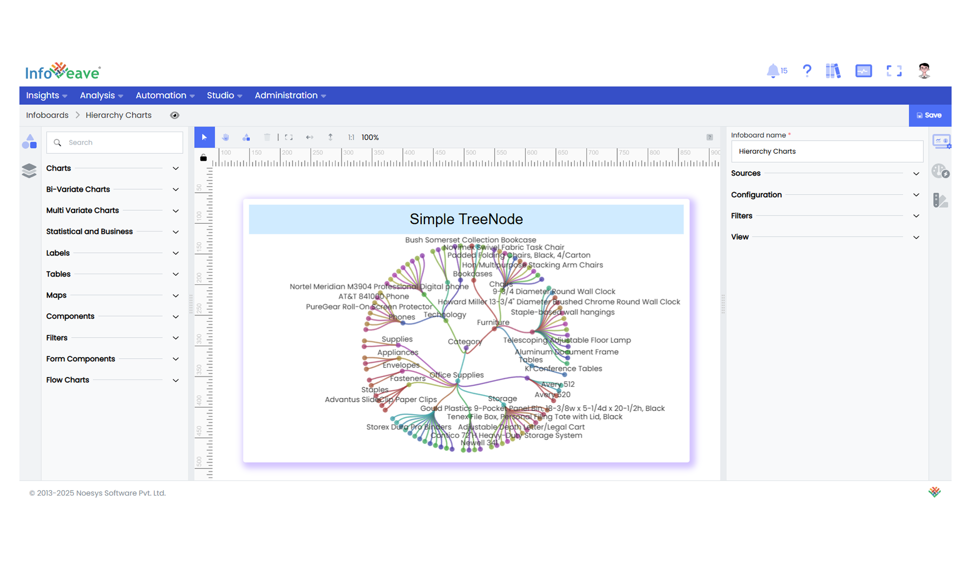
# TreeNode
The **Tree Node Chart** visualizes hierarchical data in a tree-like structure, where each branch represents a category or grouping, and leaves represent data values.
This chart is well-suited for displaying nested relationships and multi-level category breakdowns.
It supports multiple layouts such as **Orthogonal** and **Radial**, and orientations like **Left-Right**, **Top-Bottom**, and others.
**Use cases:**
- Displaying **hierarchical category structures**.
- Visualizing **organization charts** or **file directory systems**.
- Showing **breakdowns of cumulative totals into contributing groups**.
- Mapping **multi-level relationships or drilldowns** interactively.
---
## ⚙️ Setup
1. Drag the **Tree Node Chart** widget from the chart library onto your designer workspace.
2. Select the chart.
3. Go to the [Widget Configuration](/insights-v8/guide-to-infoboard-designer/customize-panel/configure/) tab in the Configuration panel.
4. Under the Configuration panel tab, select the [Basic Configuration](/insights-v8/guide-to-infoboard-designer/customize-panel/configure/#basic) option to access essential settings for the Tree Node Chart.
5. Select the [Source](/insights-v8/guide-to-infoboard-designer/customize-panel/setup/#sources) from which the chart will fetch its data.
6. Map:
- **[Measure](/studio-v8/datasources/measures-dimensions-and-hierarchies/)** — Numeric value representing the magnitude or cumulative value at each node.
- **[Dimension](/studio-v8/datasources/measures-dimensions-and-hierarchies/)** — Categorical value(s) representing the tree’s hierarchical branches.
- Multiple Dimensions can be assigned (1–5 levels) to define multi-tier hierarchies.
7. Optionally add a **Date** field for time-based filtering.
---
## 📊 Basic Configuration
| Configuration Item | Description |
|:---------------------|:-------------|
| **[Source](/insights-v8/guide-to-infoboard-designer/customize-panel/setup/#sources)** | The data source to query for chart values. |
| **[Measure](/studio-v8/datasources/measures-dimensions-and-hierarchies/)** | Numeric value representing the size or total associated with each node. |
| **[Dimension](/studio-v8/datasources/measures-dimensions-and-hierarchies/)** | Categorical value(s) representing each level of the tree. Supports 1 to 5 levels. |
| **Date Field** (optional) | Enables date-based filtering and drilldown capability. |
---
## 🎨 Chart Customizations
| Category | Options & Description |
|:----------------------------|:-----------------------------------------------------------|
| **[General](/insights-v8/guide-to-infoboard-designer/customize-panel/customization-tab/#general)** | Theme, background, border, and interactivity options. |
| **[Title](/insights-v8/guide-to-infoboard-designer/customize-panel/customization-tab/#title)** | Chart title, font, alignment, and visibility settings. |
| **[Sorting](/insights-v8/guide-to-infoboard-designer/customize-panel/customization-tab/#sorting)** | Control sorting of nodes at each hierarchy level. |
| **[Grid](/insights-v8/guide-to-infoboard-designer/customize-panel/customization-tab/#grid)** | Manage padding and chart grid layout. |
| **[Series](/insights-v8/guide-to-infoboard-designer/customize-panel/customization-tab/#series-customization)** | Control node shapes, link styles, colors, label placement, and value formatting. |
| **[Tooltip](/insights-v8/guide-to-infoboard-designer/customize-panel/customization-tab/#tooltip)** | Tooltip content, format, and triggers. |
| **Others** | Configure layout style (Orthogonal, Radial), orientation (Top-Bottom, Left-Right etc.), expand/collapse behavior, roaming (panning/zooming), tree depth visibility, and line curveness. |
---
## 📊 Example Visualization