---
title: "Bar"
description: "A classic chart visualization for comparing numerical values across discrete categories with optional grouping, stacking, and percentage display."
group: Charts
tags: [Visualization, Chart, Dashboard, Insights, Comparative Analysis]
---
import { Aside, Steps } from '@astrojs/starlight/components';
# Bar
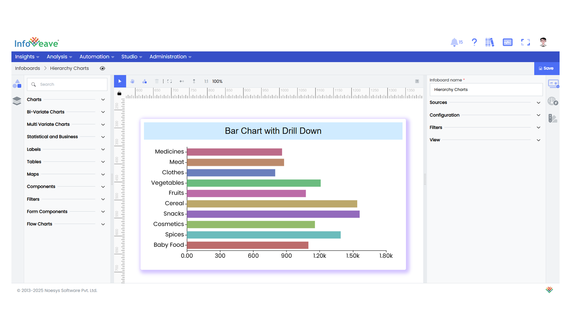
The **Bar Chart** is a widely used categorical visualization that compares numerical values across categories using horizontal bars. Each bar's length represents the magnitude of a numerical measure, plotted along a **Numerical X-axis**, while categories are arranged on the **Y-axis**.
It supports **grouped, stacked, and percentage-stacked** bar arrangements, with options for colorizing single-series charts.
This chart type is particularly effective when analyzing categorical comparisons, segmented breakdowns, or ranked values in dashboards and reports.
**Use cases:**
- Comparing **sales revenue** by **product categories (Y-axis)**, grouped by **region (Group)**.
- Displaying **survey responses** across **answer choices**, segmented by **demographics**.
- Analyzing **error occurrences** by **application module**, stacked by **severity levels**.
---
## ⚙️ Setup
1. Drag the **Bar Chart** widget from the chart library onto your designer workspace.
2. Select the chart.
3. Go to the [Widget Configuration](/insights-v8/guide-to-infoboard-designer/customize-panel/configure/) tab in the Configuration panel.
4. Under the Configuration panel tab, select the [Basic Configuration](/insights-v8/guide-to-infoboard-designer/customize-panel/configure/#basic) option to access the essential settings for the Bar Chart.
5. Select the [Source](/insights-v8/guide-to-infoboard-designer/customize-panel/setup/#sources) which the chart will pull the data from.
6. Map:
- **[Measure (Value)](/studio-v8/datasources/measures-dimensions-and-hierarchies/)** — Numerical value representing the length of each bar.
- **[Dimension (Axis)](/studio-v8/datasources/measures-dimensions-and-hierarchies/)** — Categorical value for the vertical axis labels.
- **[Group](/studio-v8/datasources/measures-dimensions-and-hierarchies/)** — Optional dimension to group bars under each category.
7. Optionally add a **Date** field for time-based filtering.
8. Enable **Hide Zero Values** to omit bars with zero values if needed.
---
## 📊 Basic Configuration
| Configuration Item | Description |
|:---------------------|:-------------|
| **[Source](/insights-v8/guide-to-infoboard-designer/customize-panel/setup/#sources)** | Source providing the data for measures and dimensions. |
| **[Measure (Value)](/studio-v8/datasources/measures-dimensions-and-hierarchies/)** | Numeric value represented by the length of each bar. |
| **[Dimension (Axis)](/studio-v8/datasources/measures-dimensions-and-hierarchies/)** | Categorical value for the Y-axis labels. |
| **[Group](/studio-v8/datasources/measures-dimensions-and-hierarchies/)** | Optional — Categorical field for grouping multiple bars per category. |
| **Date Field** (optional) | Date dimension for time-based data filtering. |
| **Hide Zero Values** | Option to suppress bars with zero value from display. |
---
## 🎨 Chart Customizations
| Category | Options & Description |
|:----------------------------|:-----------------------------------------------------------|
| **[General](/insights-v8/guide-to-infoboard-designer/customize-panel/customization-tab/#general)** | Modify the chart’s background color, borders, shadows, and drill-out options. |
| **[Title](/insights-v8/guide-to-infoboard-designer/customize-panel/customization-tab/#title)** | Enable and customize chart title text, alignment, font, and color. |
| **[Sorting](/insights-v8/guide-to-infoboard-designer/customize-panel/customization-tab/#sorting)** | Define custom sort orders for the Y-axis categories. |
| **[Grid](/insights-v8/guide-to-infoboard-designer/customize-panel/customization-tab/#grid)** | Adjust chart margins, grid spacing, and padding around the plot area. |
| **[Legend](/insights-v8/guide-to-infoboard-designer/customize-panel/customization-tab/#legends)** | Toggle visibility, position, orientation, and customize legend labels (for grouped bars). |
| **[HeatMap](/insights-v8/guide-to-infoboard-designer/customize-panel/customization-tab/#heatmap)** | Optionally configure a color gradient map to represent value intensity. |
| **[Categorical Axis (Y)](/insights-v8/guide-to-infoboard-designer/customize-panel/customization-tab/#categorical-axis)** | Configure Y-axis labels, intervals, rotation, and range sliders. |
| **[Numerical Axis (X)](/insights-v8/guide-to-infoboard-designer/customize-panel/customization-tab/#numerical-axis)** | Control X-axis value scaling (linear/logarithmic), labels, grid lines, and ranges. |
| **[Series](/insights-v8/guide-to-infoboard-designer/customize-panel/customization-tab/#series-customization)** | Style bar colors, stacking behavior, label positions, and patterns. |
| **[Tooltip](/insights-v8/guide-to-infoboard-designer/customize-panel/customization-tab/#tooltip)** | Configure tooltip content, formatting, and hover behavior. |
| **Others** | Control **Stack**, **Stack as Percentage**, and **Colorize Single Series** options. |
---
## 📊 Example Visualization