---
title: "Table"
description: "A flexible, customizable table visualization supporting summaries, totals, tooltips, and drilldowns."
group: Charts
tags: [Table, Data, Grid, Summary, Totals, Drilldown]
---
import { Aside, Steps } from '@astrojs/starlight/components';
# Table
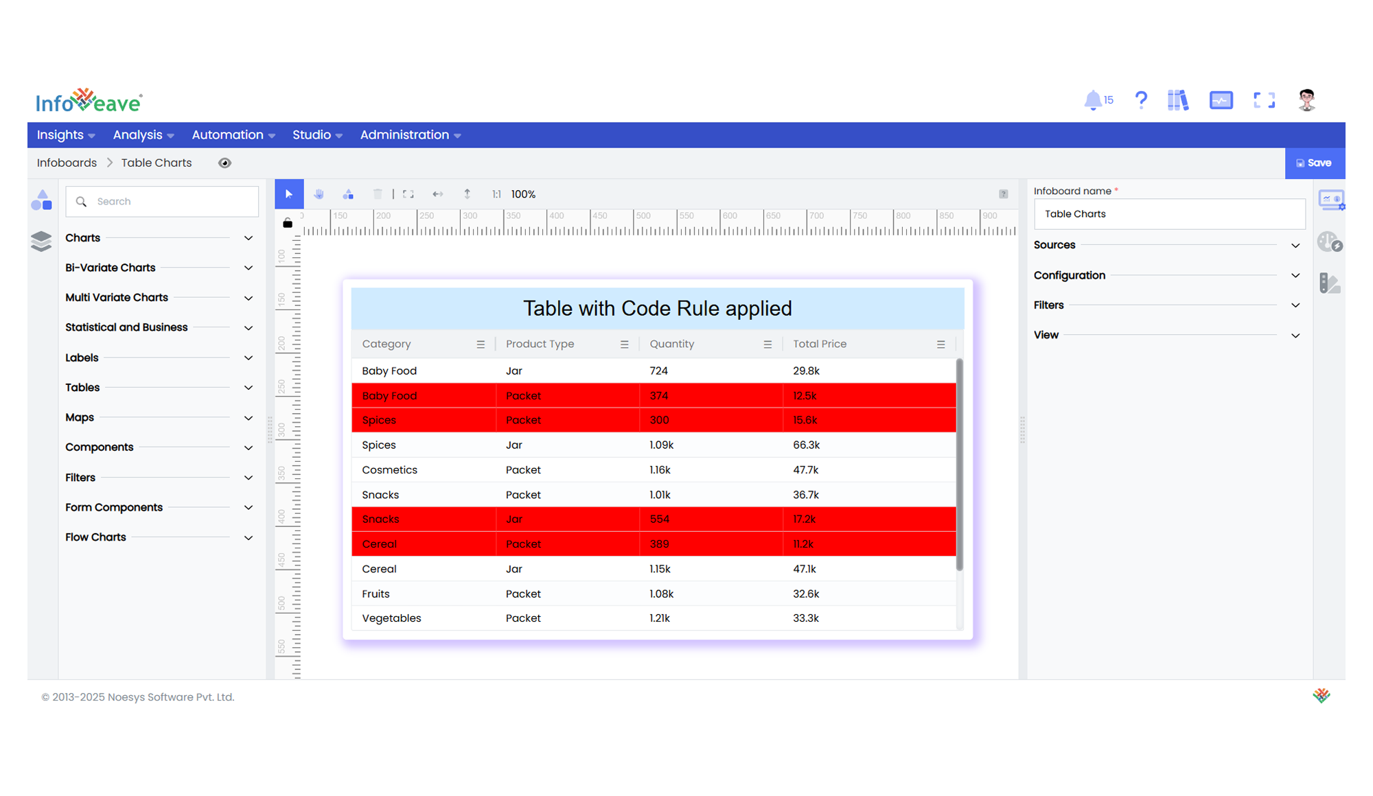
The **Table** component displays data in a tabular format with customizable headers, borders, row and column styles.
The table widget is widely used in dashboards to present data in a clear and concise manner as rows and columns, allowing you to draw insights and make informed decisions. They are ideal for summarizing, comparing, and analyzing data across multiple dimensions and measures.
**Use cases:**
- Tabular display of multi-column business data.
- Summary reporting with totals row.
- Embedding subviews on cell hover.
---
## ⚙️ Setup
1. Drag the **Table** widget from the chart library onto your designer workspace.
2. Select the chart.
3. Go to the [Widget Configuration](/insights-v8/guide-to-infoboard-designer/customize-panel/configure/) tab in the Configuration panel.
4. Under the Configuration panel tab, select the [Basic Configuration](/insights-v8/guide-to-infoboard-designer/customize-panel/configure/#basic) option to access essential settings for the Table.
5. Select the [Source](/insights-v8/guide-to-infoboard-designer/customize-panel/setup/#sources) from which the chart will fetch its data.
6. Map:
- **[Dimensions](/studio-v8/datasources/measures-dimensions-and-hierarchies/)** — Used for grouping and drilldowns.
- **[Measures](/studio-v8/datasources/measures-dimensions-and-hierarchies/)** — Numeric values for display and summarization.
---
## 📊 Basic Configuration
| Configuration Item | Description |
|:---------------------|:-------------|
| **[Source](/insights-v8/guide-to-infoboard-designer/customize-panel/setup/#sources)** | The data source to query for tabular data. |
| **[Dimensions](/studio-v8/datasources/measures-dimensions-and-hierarchies/)** | Columns representing categorical values. |
| **[Measures](/studio-v8/datasources/measures-dimensions-and-hierarchies/)** | Columns containing numeric values. |
---
## 🎨 Chart Customizations
| Category | Options & Description |
|:----------------------------|:-----------------------------------------------------------|
| **[General](/insights-v8/guide-to-infoboard-designer/customize-panel/customization-tab/#general)** | Theme, background, borders, and interactivity options. |
| **[Title](/insights-v8/guide-to-infoboard-designer/customize-panel/customization-tab/#title)** | Chart title, font, alignment, and visibility settings. |
| **[Columns](/insights-v8/guide-to-infoboard-designer/customize-panel/customization-tab/#columns)** | Configure column visibility, order, and formatting. |
| **[Table](/insights-v8/guide-to-infoboard-designer/customize-panel/customization-tab/#table)** | Control header and totals backgrounds, row/column borders, and summary row display. |
| **[Tooltip](/insights-v8/guide-to-infoboard-designer/customize-panel/customization-tab/#tooltip)** | Configure tooltips and subview displays on hover. |
---
## 📊 Example Table