---
title: "Scatter Single Axis"
description: "A scatter chart visualizing multiple grouped data distributions along independent single axes. Ideal for comparative trend and distribution analysis."
group: Charts
tags: [Visualization, Chart, Dashboard, Scatter, Distribution, Single Axis, Comparative Analysis]
---
import { Aside, Steps } from '@astrojs/starlight/components';
# Scatter Single Axis
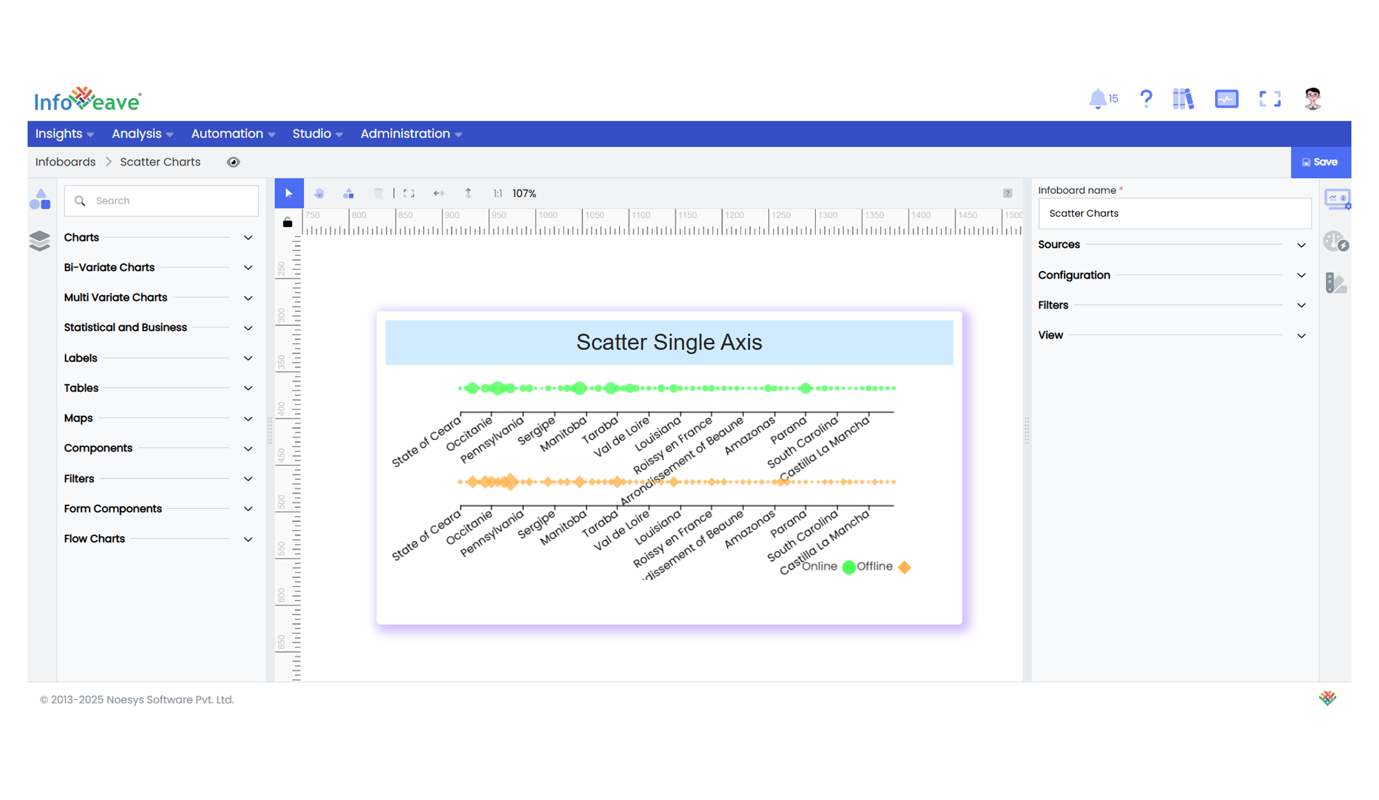
The **Scatter Single Axis Chart** displays multiple scatter plots along parallel, independent single axes.
It’s particularly effective for visualizing **distribution patterns, outliers, and value concentration across multiple groups or categories**.
Each axis represents a **separate group**, with data points distributed along it based on a categorical or sequential dimension and their numeric measure values.
**Use cases:**
- Visualizing **comparative distributions** across multiple groups.
- Detecting **outliers and clusters** within categories.
- Observing how different groups trend relative to a common dimension.
---
## ⚙️ Setup
1. Drag the **Scatter Single Axis Chart** widget from the chart library onto your designer workspace.
2. Select the chart.
3. Go to the [Widget Configuration](/insights-v8/guide-to-infoboard-designer/customize-panel/configure/) tab in the Configuration panel.
4. Under the Configuration panel tab, select the [Basic Configuration](/insights-v8/guide-to-infoboard-designer/customize-panel/configure/#basic) option to access essential settings for the Scatter Single Axis Chart.
5. Select the [Source](/insights-v8/guide-to-infoboard-designer/customize-panel/setup/#sources) from which the chart will fetch its data.
6. Map:
- **[Measure (Value)](/studio-v8/datasources/measures-dimensions-and-hierarchies/)** — Numeric value determining the size of each scatter point.
- **[Dimension (Axis)](/studio-v8/datasources/measures-dimensions-and-hierarchies/)** — Categorical or sequential value plotted along the single axis.
- **[Group](/studio-v8/datasources/measures-dimensions-and-hierarchies/)** — Categorical field splitting the chart into multiple independent single axes.
7. Optionally add a **Date** field for time-based filtering.
---
## 📊 Basic Configuration
| Configuration Item | Description |
|:---------------------|:-------------|
| **[Source](/insights-v8/guide-to-infoboard-designer/customize-panel/setup/#sources)** | The data source to query for chart values. |
| **[Measure (Value)](/studio-v8/datasources/measures-dimensions-and-hierarchies/)** | Numeric value determining scatter point size. |
| **[Dimension (Axis)](/studio-v8/datasources/measures-dimensions-and-hierarchies/)** | Categorical or sequential value plotted along the axis. |
| **[Group](/studio-v8/datasources/measures-dimensions-and-hierarchies/)** | (Optional) Categorical field splitting the scatter points into separate single axes. |
| **Date Field** (optional) | Enables date-based filtering and drilldown capability. |
---
## 🎨 Chart Customizations
| Category | Options & Description |
|:----------------------------|:-----------------------------------------------------------|
| **[General](/insights-v8/guide-to-infoboard-designer/customize-panel/customization-tab/#general)** | Theme, background, border, and interactivity options. |
| **[Title](/insights-v8/guide-to-infoboard-designer/customize-panel/customization-tab/#title)** | Chart title, font, alignment, and visibility settings. |
| **[Sorting](/insights-v8/guide-to-infoboard-designer/customize-panel/customization-tab/#sorting)** | Control sorting of categories or series order. |
| **[Grid](/insights-v8/guide-to-infoboard-designer/customize-panel/customization-tab/#grid)** | Manage padding and subplot spacing. |
| **[Legend](/insights-v8/guide-to-infoboard-designer/customize-panel/customization-tab/#legends)** | Show/hide, position, and format for series legends. |
| **[HeatMap](/insights-v8/guide-to-infoboard-designer/customize-panel/customization-tab/#heatmap)** | Apply color gradients based on value ranges for enhanced visual density. |
| **[Categorical Axis](/insights-v8/guide-to-infoboard-designer/customize-panel/customization-tab/#categorical-axis)** | Customize labels, rotation, and intervals along the single axis. |
| **[Series](/insights-v8/guide-to-infoboard-designer/customize-panel/customization-tab/#series-customization)** | Configure scatter point symbol, size scaling, colors, and data labels. |
| **[Tooltip](/insights-v8/guide-to-infoboard-designer/customize-panel/customization-tab/#tooltip)** | Tooltip content, format, and triggers for data points. |
| **Others** | Set symbol size limits, subplot height, and gap between subplots. |
---
## 📊 Example Visualization