---
title: "Pareto"
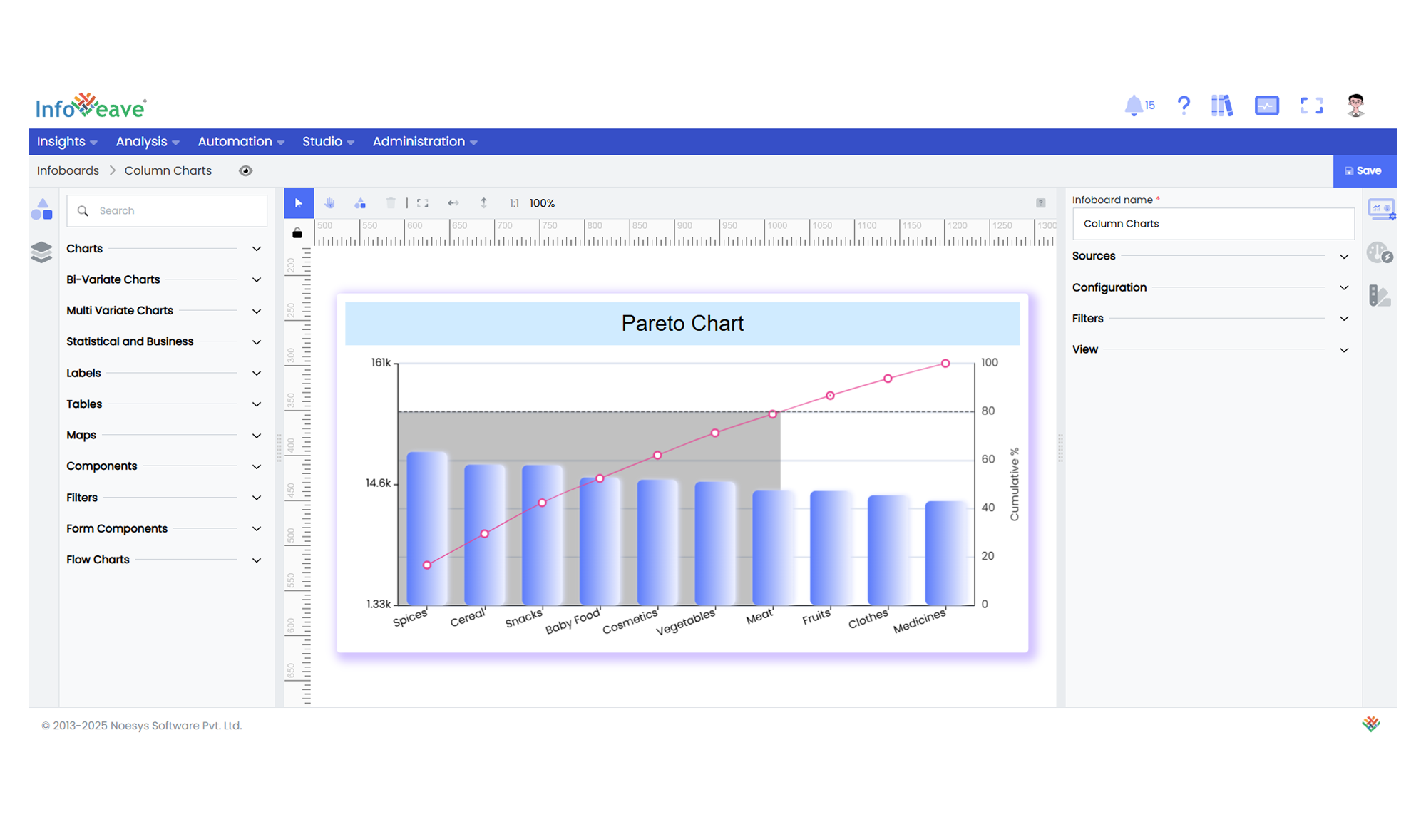
description: "A dual-axis chart combining a bar chart for individual values and a line chart for cumulative percentages, often used to highlight the most significant factors in a dataset."
group: Charts
tags: [Visualization, Chart, Dashboard, Pareto, 80/20 Rule, Cumulative Analysis]
---
import { Aside, Steps } from '@astrojs/starlight/components';
# Pareto
The **Pareto Chart** is a composite visualization that displays individual values as bars in descending order, along with a cumulative percentage line.
It is widely used in **quality control**, **resource prioritization**, and **root cause analysis** — following the **Pareto Principle (80/20 rule)** where a small number of categories contribute to the majority of the effect.
**Use cases:**
- Identifying **key contributors** to a total.
- Highlighting **most frequent issues or defects** in quality management.
- Displaying **cumulative distributions** and thresholds (like 70%, 80%, 90%).
---
## ⚙️ Setup
1. Drag the **Pareto Chart** widget from the chart library onto your designer workspace.
2. Select the chart.
3. Go to the [Widget Configuration](/insights-v8/guide-to-infoboard-designer/customize-panel/configure/) tab in the Configuration panel.
4. Under the Configuration panel tab, select the [Basic Configuration](/insights-v8/guide-to-infoboard-designer/customize-panel/configure/#basic) option to access essential settings for the Pareto Chart.
5. Select the [Source](/insights-v8/guide-to-infoboard-designer/customize-panel/setup/#sources) from which the chart will fetch its data.
6. Map:
- **[Measure (Value)](/studio-v8/datasources/measures-dimensions-and-hierarchies/)** — Numeric value for the bar series (typically representing occurrences, cost, or impact).
- **[Dimension (Axis)](/studio-v8/datasources/measures-dimensions-and-hierarchies/)** — Category names to be ranked and displayed on the axis.
7. Optionally add a **Date** field for time-based filtering.
---
## 📊 Basic Configuration
| Configuration Item | Description |
|:---------------------|:-------------|
| **[Source](/insights-v8/guide-to-infoboard-designer/customize-panel/setup/#sources)** | The data source to query for chart values. |
| **[Measure (Value)](/studio-v8/datasources/measures-dimensions-and-hierarchies/)** | Numeric value plotted as bars. |
| **[Dimension (Axis)](/studio-v8/datasources/measures-dimensions-and-hierarchies/)** | Categorical values for the primary axis (sorted by value descending). |
| **Date Field** (optional) | Enables date-based filtering and drilldown capability. |
---
## 🎨 Chart Customizations
| Category | Options & Description |
|:----------------------------|:-----------------------------------------------------------|
| **[General](/insights-v8/guide-to-infoboard-designer/customize-panel/customization-tab/#general)** | Theme, background, border, and interactivity options. |
| **[Title](/insights-v8/guide-to-infoboard-designer/customize-panel/customization-tab/#title)** | Chart title, font, alignment, and visibility settings. |
| **[Sorting](/insights-v8/guide-to-infoboard-designer/customize-panel/customization-tab/#sorting)** | N/A — Pareto charts sort values automatically in descending order. |
| **[Grid](/insights-v8/guide-to-infoboard-designer/customize-panel/customization-tab/#grid)** | Manage padding and chart grid layout. |
| **[Categorical Axis](/insights-v8/guide-to-infoboard-designer/customize-panel/customization-tab/#categorical-axis)** | Customize category axis labels, rotation, and intervals. |
| **[Numerical Axis](/insights-v8/guide-to-infoboard-designer/customize-panel/customization-tab/#numerical-axis)** | Adjust value axis scale, formatting, and log scale for bar values. |
| **[Series](/insights-v8/guide-to-infoboard-designer/customize-panel/customization-tab/#series-customization)** | Control bar color, cumulative line color, line type, markers, stacking options, and Pareto area highlight. |
| **[Cumulative Axis](/insights-v8/guide-to-infoboard-designer/customize-panel/customization-tab/#numerical-axis)** | Customize the secondary axis for cumulative percentage scale and label format. |
| **Cumulative Line** | cumulative line color, line type, markers, stacking options, and Pareto area highlight. |
| **[Pareto Options](/insights-v8/guide-to-infoboard-designer/customize-panel/customization-tab/#pareto)** | Configure Pareto rule (80/20, 70/30), split line visibility and color, and Pareto area fill color. |
| **[Tooltip](/insights-v8/guide-to-infoboard-designer/customize-panel/customization-tab/#tooltip)** | Tooltip content, format, and triggers for bars, cumulative line, and Pareto highlights. |
| **Others** | Orientation is fixed to Horizontal (Category X, Value Y) for Pareto charts. |
---
## 📊 Example Visualization