---
title: "Alluvial"
description: "A flow diagram visualization used to depict how values move or are distributed between categories or stages in a process."
group: Charts
tags: [Visualization, Chart, Dashboard, Sankey, Flow Diagram, Process Analysis]
---
import { Aside, Steps } from '@astrojs/starlight/components';
# Alluvial
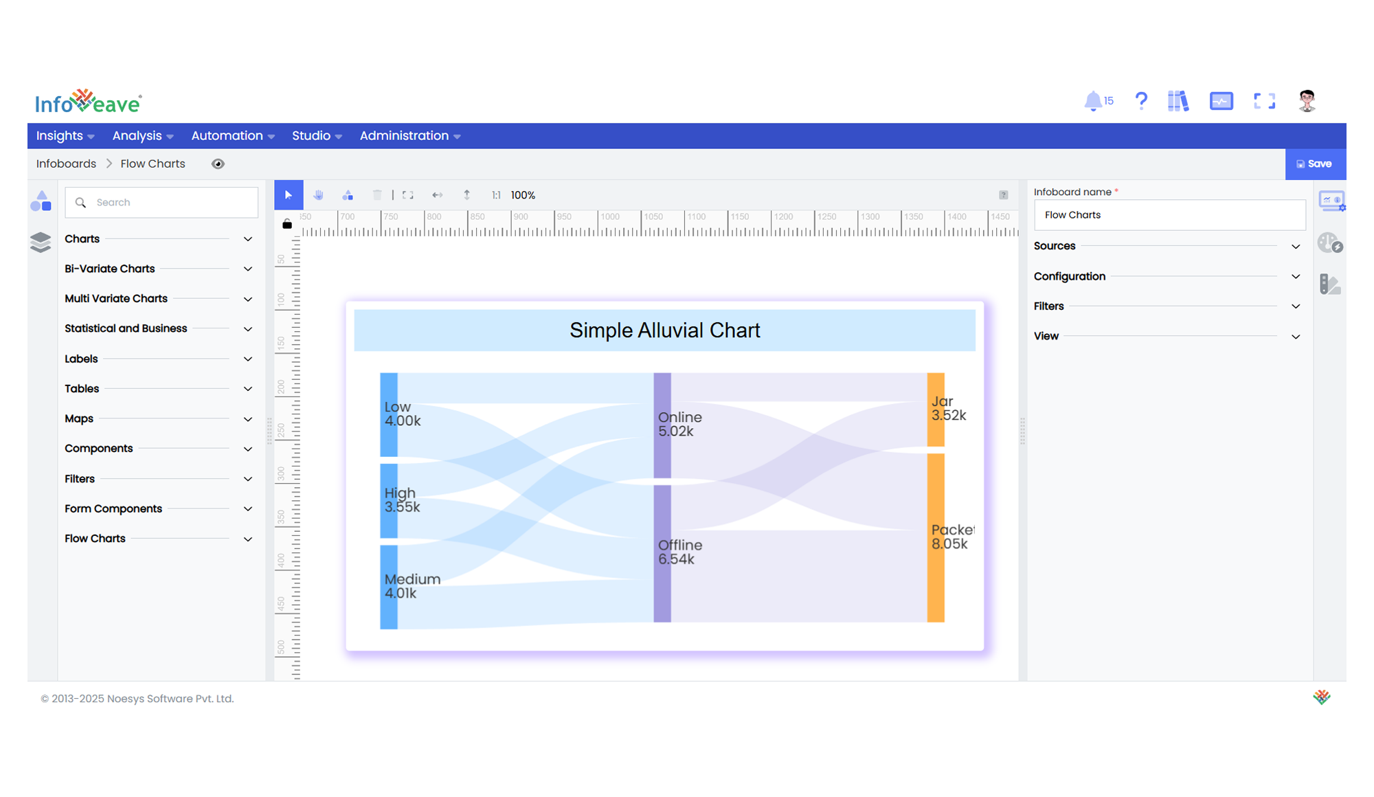
The **Alluvial Chart** (also known as a Sankey Diagram) visualizes flows and relationships between different categories or stages.
It represents nodes (categories) and weighted links (flows) between them, making it ideal for illustrating how values split, combine, or transition through a system.
**Use cases:**
- Displaying **process flows** or movement between stages.
- Visualizing **distribution of values across multiple categories**.
- Mapping **data pathways or transfers** in a system.
---
## ⚙️ Setup
1. Drag the **Alluvial Chart** widget from the chart library onto your designer workspace.
2. Select the chart.
3. Go to the [Widget Configuration](/insights-v8/guide-to-infoboard-designer/customize-panel/configure/) tab in the Configuration panel.
4. Under the Configuration panel tab, select the [Basic Configuration](/insights-v8/guide-to-infoboard-designer/customize-panel/configure/#basic) option to access essential settings for the Alluvial Chart.
5. Select the [Source](/insights-v8/guide-to-infoboard-designer/customize-panel/setup/#sources) from which the chart will fetch its data.
6. Map:
- **[Measure](/studio-v8/datasources/measures-dimensions-and-hierarchies/)** — Numeric value representing the flow quantity between nodes.
- **[Dimension](/studio-v8/datasources/measures-dimensions-and-hierarchies/)** — Sequential categorical values representing stages or nodes. Minimum of **2** dimensions required.
7. Optionally add a **Date** field for time-based filtering.
---
## 📊 Basic Configuration
| Configuration Item | Description |
|:---------------------|:-------------|
| **[Source](/insights-v8/guide-to-infoboard-designer/customize-panel/setup/#sources)** | The data source to query for chart values. |
| **[Measure](/studio-v8/datasources/measures-dimensions-and-hierarchies/)** | Numeric value representing the weight or quantity of the flow between nodes. |
| **[Dimension](/studio-v8/datasources/measures-dimensions-and-hierarchies/)** | Categorical values representing stages or nodes. Minimum 2, maximum 5 sequential dimensions. |
| **Date Field** (optional) | Enables date-based filtering and drilldown capability. |
---
## 🎨 Chart Customizations
| Category | Options & Description |
|:----------------------------|:-----------------------------------------------------------|
| **[General](/insights-v8/guide-to-infoboard-designer/customize-panel/customization-tab/#general)** | Theme, background, border, and interactivity options. |
| **[Title](/insights-v8/guide-to-infoboard-designer/customize-panel/customization-tab/#title)** | Chart title, font, alignment, and visibility settings. |
| **[Sorting](/insights-v8/guide-to-infoboard-designer/customize-panel/customization-tab/#sorting)** | Control sorting of categories or links. |
| **[Grid](/insights-v8/guide-to-infoboard-designer/customize-panel/customization-tab/#grid)** | Manage padding and layout margins. |
| **[Series](/insights-v8/guide-to-infoboard-designer/customize-panel/customization-tab/#series-customization)** | Configure node colors, flow colors, borders, opacity, label settings, and line curveness. |
| **[Tooltip](/insights-v8/guide-to-infoboard-designer/customize-panel/customization-tab/#tooltip)** | Tooltip content, format, and triggers for displaying flow details. |
| **Others** | Set **Orientation** (Horizontal or Vertical), **Draggable**, **Node Width**, **Node Gap**, and **Node Alignment**. |
---
## 📊 Example Visualization