---
title: "Circle Packing"
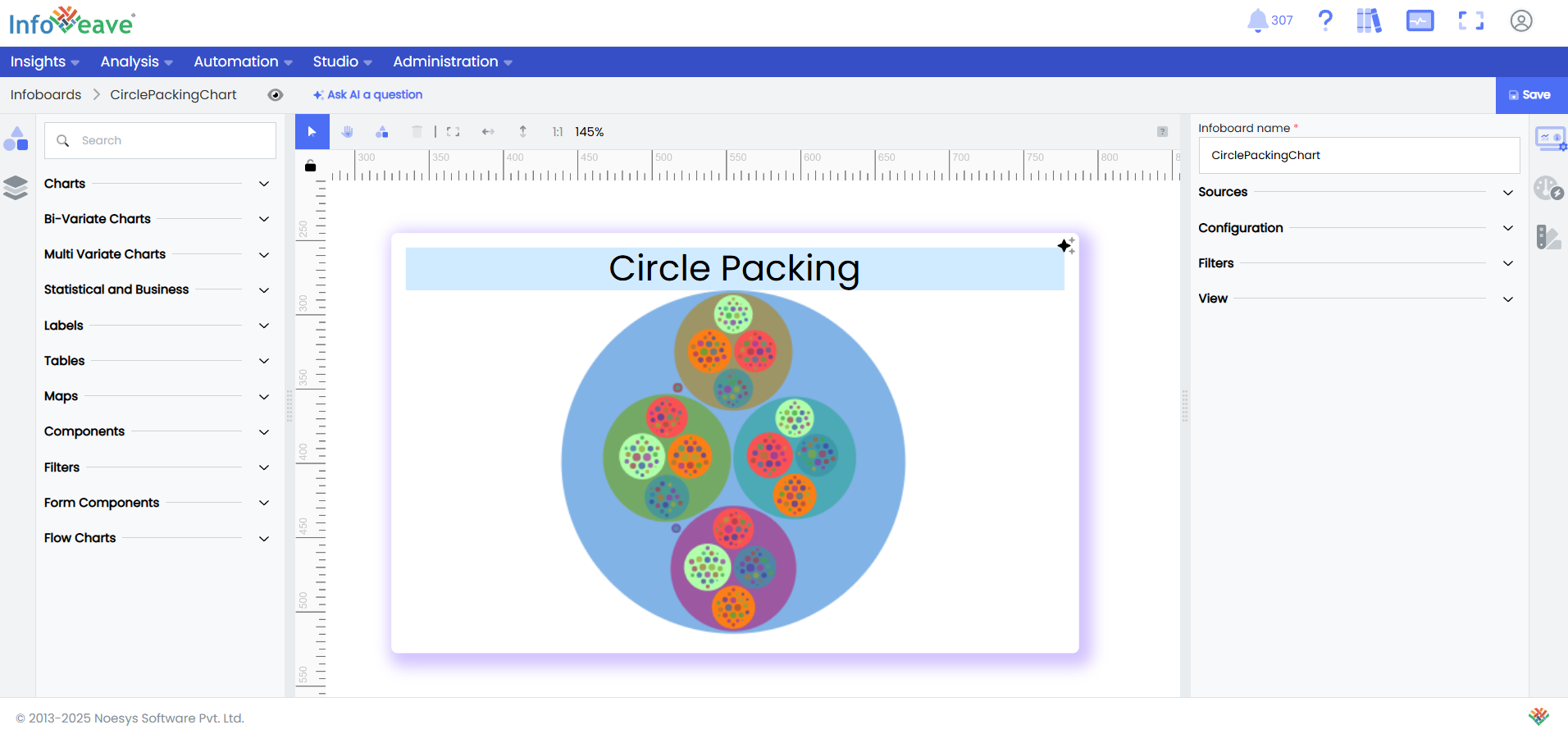
description: "A nested circle visualization displaying hierarchical relationships by size."
group: Charts
tags: [Visualization, Chart, Dashboard, Insights, Matrix, Scatter, Comparative Analysis]
---
import { Aside, Steps } from '@astrojs/starlight/components';
# Circle Packing
The **Circle Packing Chart** is a hierarchical visualization technique that displays **nested categorical relationships** using a series of enclosing circles of varying sizes. Each circle represents a node in the hierarchy, with size encoding a quantitative measure (e.g., count, value, or weight), and position reflecting parent-child relationships.
Unlike treemaps that use rectangles to depict hierarchical space, Circle Packing Charts offer a more **aesthetically compact and organic layout**, making them particularly effective for visualizing **part-to-whole relationships** in multi-level categorical data.
This chart type is especially useful when you want to explore **nested groupings** or **drill into layered structures** (such as organization hierarchies, file systems, or product taxonomies) with an intuitive representation of relative proportions and group containment.
Optional **color encoding** can be applied to represent additional dimensions such as category, status, or performance metrics.
**Use cases:**
- Visualizing **organizational structure** with employees nested under departments, and departments under business units.
- Exploring **file storage usage**, showing folders and subfolders sized by their total file size.
- Analyzing **customer segmentation**, where segments are grouped by demographic tiers and sized by revenue contribution.
- Displaying **product categories** and subcategories in an e-commerce platform, sized by number of items or sales volume.
- Understanding **taxonomy of biological species**, grouped by genus and family, sized by population or prevalence.
---
## ⚙️ Setup
1. Drag the **Circle Packing Chart** widget from the chart library onto your designer workspace.
2. Select the chart.
3. Go to the [Widget Configuration](/insights-v8/guide-to-infoboard-designer/customize-panel/configure/) tab in the Customize panel.
4. Under the Configuration tab, select the [Basic Configuration](/insights-v8/guide-to-infoboard-designer/customize-panel/configure/#basic) option to access the essential settings for the circle packing chart.
5. Select the [Source](/insights-v8/guide-to-infoboard-designer/customize-panel/setup/#sources) which the chart will pull the data from the option.
6. Map:
- **[Measure (Value)](/studio-v8/datasources/measures-dimensions-and-hierarchies/)** — Numerical value determining symbol size.
- **[Dimension XAxis](/studio-v8/datasources/measures-dimensions-and-hierarchies/)** — Categorical field for horizontal grouping.
- **[Dimension YAxis](/studio-v8/datasources/measures-dimensions-and-hierarchies/)** — Categorical field for vertical grouping.
- **[Group](/studio-v8/datasources/measures-dimensions-and-hierarchies/)** — Required dimension for separating data into multiple series.
7. Optionally add a **Date** field for time-based filtering.
8. Enable **Hide Zero Values** to omit symbols with zero values if needed.
---
## 📊 Basic Configuration
| Configuration Item | Description |
|:---------------------|:-------------|
| **[Source](/insights-v8/guide-to-infoboard-designer/customize-panel/setup/#sources)** | Source providing the data for measures and dimensions. |
| **[Measure (Value)](/studio-v8/datasources/measures-dimensions-and-hierarchies/)** | Numeric value that determines symbol size. |
| **[Dimension](/studio-v8/datasources/measures-dimensions-and-hierarchies/)** | Categorical value(s) representing each level of the circle. Supports 1 to 5 levels. |
| **Date Field** (optional) | Date dimension for time-based data filtering. |
| **Hide Zero Values** | Option to suppress symbols with zero value from display. |
---
## 🎨 Chart Customizations
| Category | Options & Description |
|:----------------------------|:-----------------------------------------------------------|
| **[General](/insights-v8/guide-to-infoboard-designer/customize-panel/customization-tab/#general)** |Theme, background, border, and interactivity options.
| **[Title](/insights-v8/guide-to-infoboard-designer/customize-panel/customization-tab/#title)** | Enable and customize chart title text, alignment, font, and color. |
| **[Series](/insights-v8/guide-to-infoboard-designer/customize-panel/customization-tab/#series-customization)** | Style symbols: adjust size ranges, enable stacking, toggle labels, and set symbol offset for multiple series. |
| **[Tooltip](/insights-v8/guide-to-infoboard-designer/customize-panel/customization-tab/#tooltip)** | Control tooltip content, formatting, and visibility on hover. |
| **Others** | Customize parent circle and label line. |
---
## 📊 Example Visualization