---
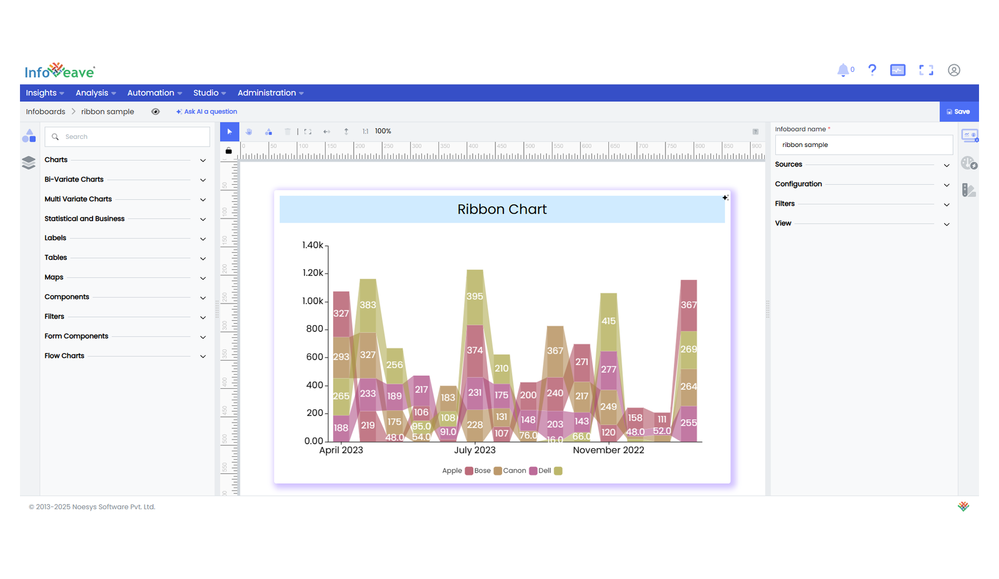
title: "Ribbon"
description: "Visualizes sub-category distributions and flows across a categorical axis with connecting bands."
group: Charts
tags: [Visualization, Chart, Dashboard, Insights]
---
import { Aside, Steps } from '@astrojs/starlight/components';
# Ribbon
The **Ribbon Chart** is a versatile visualization used to display how multiple sub-categories contribute and evolve across a primary categorical axis. It represents each sub-category as a colored ribbon whose width corresponds to its value, and connects adjacent categories to illustrate continuity and change.
**Key Features:**
- Smooth ribbon bands showing sub-category values per category
- Connecting bridges between ribbons to highlight transitions
- Interactive legend for toggling sub-categories on/off
**Use Cases:**
- Market share breakdown by product over time
- Sales distribution by region across quarters
- Resource allocation across departments
---
## ⚙️ Setup
1. Drag the **Ribbon Chart** widget from the chart library onto the designer workspace.
2. Select the chart.
3. Go to the [Widget Configuration](/insights-v8/guide-to-infoboard-designer/customize-panel/configure/) tab in the Customize panel.
4. Under the Configuration tab, select the [Basic Configuration](/insights-v8/guide-to-infoboard-designer/customize-panel/configure/#basic) option to access the essential settings for the ribbon chart.
5. Select the [Source](/insights-v8/guide-to-infoboard-designer/customize-panel/setup/#sources) which the chart will pull the data from the option.
6.Map:
- **[Measure (Value)](/studio-v8/datasources/measures-dimensions-and-hierarchies/)** — Numerical metric plotted as ribbon width.
- **[Axis](/studio-v8/datasources/measures-dimensions-and-hierarchies/)** — Categorical dimension defining the horizontal axis (e.g., Quarter).
- **[Group](/studio-v8/datasources/measures-dimensions-and-hierarchies/)** — Sub-category dimension determining individual ribbons (e.g., Product Line).
7. Configure **Sorting** to define the order of categories.
8. Enable **Hide Zero Values** to omit symbols with zero values if needed.
---
## 📊 Basic Configuration
| Configuration Item | Description |
|:---------------------|:-------------|
| **[Source](/insights-v8/guide-to-infoboard-designer/customize-panel/setup/#sources)** | Source providing the data for measures and dimensions. |
| **[Measure (Value)](/studio-v8/datasources/measures-dimensions-and-hierarchies/)** | Numeric value that determines the ribbon width. |
| **[Axis](/studio-v8/datasources/measures-dimensions-and-hierarchies/)** | Categorical value for horizontal axis grouping. |
| **[Group](/studio-v8/datasources/measures-dimensions-and-hierarchies/)** | **Required** — Sub-category dimension for separate ribbons. |
| **Hide Zero Values** | Option to suppress symbols with zero value from display. |
|
---
## 🎨 Chart Customizations
| Category | Options & Description |
|:----------------------------|:-----------------------------------------------------------|
| **[General](/insights-v8/guide-to-infoboard-designer/customize-panel/customization-tab/#general)** | Modify the chart’s general appearance, including the background color, borders, shadows, and drill-out choices.
| **[Title](/insights-v8/guide-to-infoboard-designer/customize-panel/customization-tab/#title)** | Enable and customize chart title text, alignment, font, and color. |
| **[Sorting](/insights-v8/guide-to-infoboard-designer/customize-panel/customization-tab/#sorting)** | Define custom sort orders for categories along the X and Y axes. |
| **[Grid](/insights-v8/guide-to-infoboard-designer/customize-panel/customization-tab/#grid)** | Adjust chart margins, grid spacing, and padding around the matrix area. |
| **[Legend](/insights-v8/guide-to-infoboard-designer/customize-panel/customization-tab/#legends)** | Toggle visibility, position, orientation, and customize legend labels and icons. |
| **[Categorical Axis (X, Y)](/insights-v8/guide-to-infoboard-designer/customize-panel/customization-tab/#categorical-axis)** | Customize axis labels, intervals, rotation, visibility, and range sliders for both axes. |
| **[Series](/insights-v8/guide-to-infoboard-designer/customize-panel/customization-tab/#series-customization)** | Style symbols: adjust size ranges, enable stacking, toggle labels, and set symbol offset for multiple series. |
| **[Tooltip](/insights-v8/guide-to-infoboard-designer/customize-panel/customization-tab/#tooltip)** | Control tooltip content, formatting, and visibility on hover. |
## 📊 Example Visualization