---
title: "Line"
description: "A continuous value chart visualization connecting data points across a categorical or numerical axis to highlight trends, patterns, and fluctuations."
group: Charts
tags: [Visualization, Chart, Dashboard, Trends, Time Series, Comparative Analysis]
---
import { Aside, Steps } from '@astrojs/starlight/components';
# Line
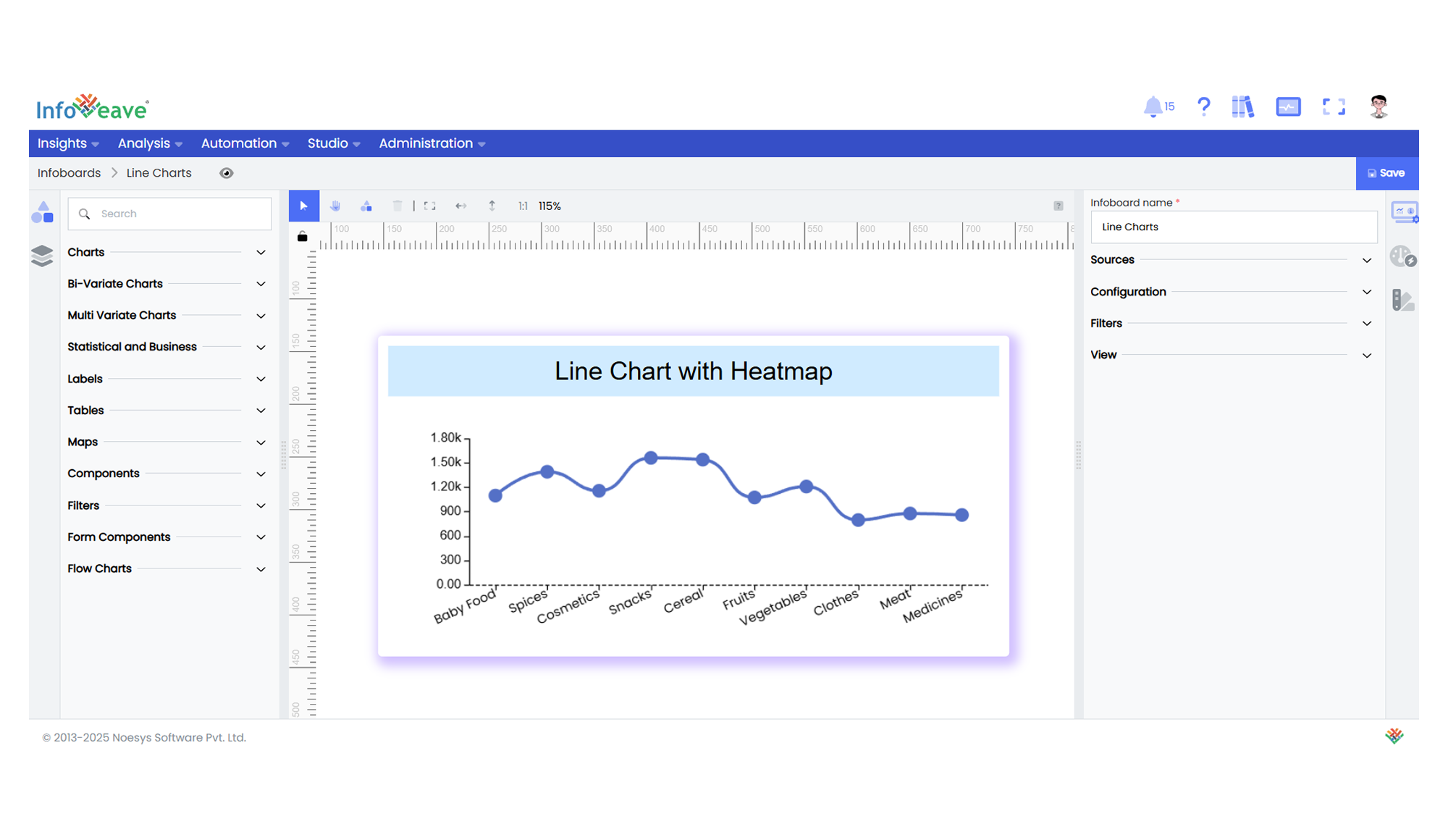
The **Line Chart** is a trend visualization chart type that displays values as points connected by lines, allowing users to observe patterns and changes over a continuous or ordered category axis.
It supports both **Horizontal (Category X, Value Y)** and **Vertical (Value X, Category Y)** orientations — adjustable via the chart’s **Orientation** option.
**Use cases:**
- Monitoring **monthly sales trends**.
- Tracking **user signups** over time.
- Comparing **KPIs across departments** or **market segments**.
---
## ⚙️ Setup
1. Drag the **Line Chart** widget from the chart library onto your designer workspace.
2. Select the chart.
3. Go to the [Widget Configuration](/insights-v8/guide-to-infoboard-designer/customize-panel/configure/) tab in the Configuration panel.
4. Under the Configuration panel tab, select the [Basic Configuration](/insights-v8/guide-to-infoboard-designer/customize-panel/configure/#basic) option to access the essential settings for the Line Chart.
5. Select the [Source](/insights-v8/guide-to-infoboard-designer/customize-panel/setup/#sources) from which the chart will fetch its data.
6. Map:
- **[Measure (Value)](/studio-v8/datasources/measures-dimensions-and-hierarchies/)** — Numeric value representing the Y (or X) axis value.
- **[Dimension (Axis)](/studio-v8/datasources/measures-dimensions-and-hierarchies/)** — Categorical or sequential value for the primary axis labels.
- **[Group](/studio-v8/datasources/measures-dimensions-and-hierarchies/)** — (Optional) Categorical value to split the line into multiple series.
7. Optionally add a **Date** field for time-based filtering.
---
## 📊 Basic Configuration
| Configuration Item | Description |
|:---------------------|:-------------|
| **[Source](/insights-v8/guide-to-infoboard-designer/customize-panel/setup/#sources)** | The data source to query for chart values. |
| **[Measure (Value)](/studio-v8/datasources/measures-dimensions-and-hierarchies/)** | Numeric value plotted as line data points. |
| **[Dimension (Axis)](/studio-v8/datasources/measures-dimensions-and-hierarchies/)** | Categorical or sequential value for primary axis labels. |
| **[Group](/studio-v8/datasources/measures-dimensions-and-hierarchies/)** | (Optional) Grouping field to split lines by category. |
| **Date Field** (optional) | Enables date filtering and drilldown capability. |
---
## 🎨 Chart Customizations
| Category | Options & Description |
|:----------------------------|:-----------------------------------------------------------|
| **[General](/insights-v8/guide-to-infoboard-designer/customize-panel/customization-tab/#general)** | Background color, border, shadow, and interactivity options. |
| **[Title](/insights-v8/guide-to-infoboard-designer/customize-panel/customization-tab/#title)** | Chart title, font, alignment, and visibility. |
| **[Sorting](/insights-v8/guide-to-infoboard-designer/customize-panel/customization-tab/#sorting)** | Control sort order of categories along the axis. |
| **[Grid](/insights-v8/guide-to-infoboard-designer/customize-panel/customization-tab/#grid)** | Manage padding, spacing, and chart grid layout. |
| **[Legend](/insights-v8/guide-to-infoboard-designer/customize-panel/customization-tab/#legends)** | Show/hide, position, and format series legends. |
| **[HeatMap](/insights-v8/guide-to-infoboard-designer/customize-panel/customization-tab/#heatmap)** | Apply color intensity gradients to highlight data ranges. |
| **[Categorical Axis](/insights-v8/guide-to-infoboard-designer/customize-panel/customization-tab/#categorical-axis)** | Customize X (or Y if vertical) axis labels, rotation, and interval. |
| **[Numerical Axis](/insights-v8/guide-to-infoboard-designer/customize-panel/customization-tab/#numerical-axis)** | Adjust scale, range, formatting, and logarithmic scale. |
| **[Series](/insights-v8/guide-to-infoboard-designer/customize-panel/customization-tab/#series-customization)** | Line color, width, area shading, symbols, smoothing, and label display. |
| **[Tooltip](/insights-v8/guide-to-infoboard-designer/customize-panel/customization-tab/#tooltip)** | Tooltip formatting, display triggers, and content. |
| **Others** | Control **Orientation** between `Horizontal` (Category X, Value Y) and `Vertical` (Value X, Category Y). |
---
## 📊 Example Visualization