---
title: "Pictorial Bar"
description: "A symbol-based bar chart where custom icons, shapes, or pictograms visually represent quantitative values in a category-based layout."
group: Charts
tags: [Visualization, Chart, Dashboard, Insights, Symbol Chart]
---
import { Aside, Steps } from '@astrojs/starlight/components';
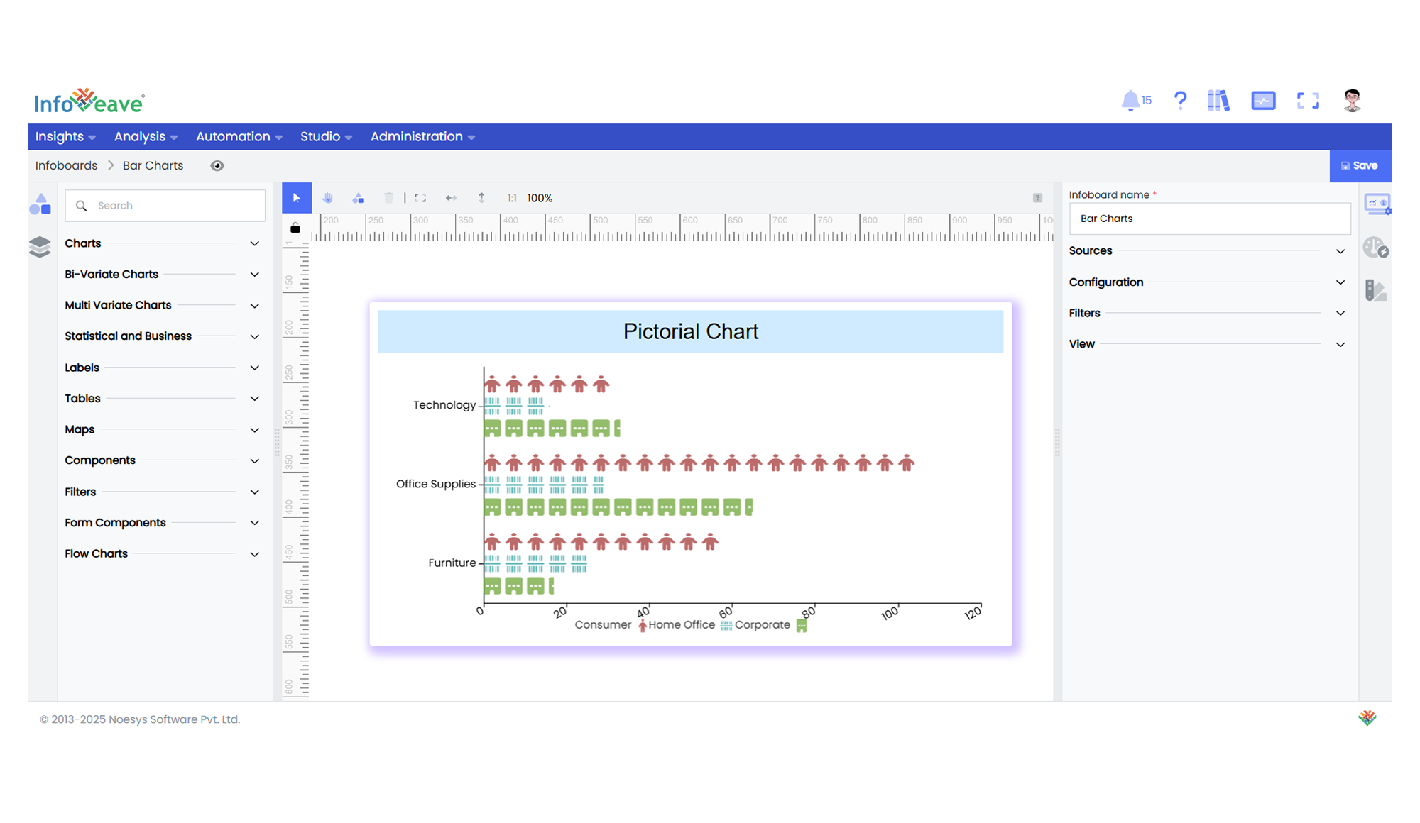
# Pictorial Bar
The **Pictorial Bar Chart** is an advanced categorical chart type where bars are constructed using repeated or scaled symbols, shapes, or pictograms instead of solid columns. It retains the clarity of a bar chart while adding an illustrative, visually engaging element, ideal for storytelling dashboards or executive summaries.
This chart allows values to be displayed either **horizontally** or **vertically**, with optional grouping support for stacked or side-by-side comparisons. Each category along an axis is paired with a pictorial bar whose size or repetition count reflects its associated value. Optionally, color encoding and heatmap gradients can further enhance data interpretation.
**Key Features:**
- Display values using custom symbols (images, icons, shapes) instead of solid bars.
- Supports **grouped series** for side-by-side or stacked comparisons.
- Orientation can be toggled between **horizontal** and **vertical** layouts.
- Offers interactive tooltips, zoom controls, and drill-down support.
- Heatmap gradients optionally highlight value intensity.
- Dynamically colorizes single-series views for enhanced readability.
**Typical use cases:**
- Representing **sales volume** by product using icons (e.g., bottles, cars, devices).
- Visualizing **employee headcounts** by department.
- Displaying **financial metrics** in a boardroom-friendly, illustrative format.
- Creating executive dashboards with icon-based value representations.
- Demonstrating **survey responses** or sentiment breakdowns with icons.
---
## ⚙️ Setup
1. Drag the **Pictorial Bar Chart** widget from the chart library onto your designer workspace.
2. Select the chart.
3. Go to the [Widget Configuration](/insights-v8/guide-to-infoboard-designer/customize-panel/configure/) tab in the Customize panel.
4. Under the Configuration tab, select the [Basic Configuration](/insights-v8/guide-to-infoboard-designer/customize-panel/configure/#basic) option to access the essential settings for the pictoral bar chart.
5. Select the [Source](/insights-v8/guide-to-infoboard-designer/customize-panel/setup/#sources) which the chart will pull the data from the option.
6. Map:
- **[Value (Measure)](/studio-v8/datasources/measures-dimensions-and-hierarchies/)** — Numeric measure representing bar size.
- **[Axis (Dimension)](/studio-v8/datasources/measures-dimensions-and-hierarchies/)** — Categorical field for the horizontal/vertical axis.
- **[Group (Optional)](/studio-v8/datasources/measures-dimensions-and-hierarchies/)** — Categorical field to group multiple series within the chart.
7. (Optional) Add a **Date** field for time-based context or filtering.
8. Choose orientation, symbol, stacking, and color options from the customization panel.
---
## 📊 Basic Configuration
| Configuration Item | Description |
|:---------------------------------------|:----------------------------------------------------------|
| **[Source](/insights-v8/guide-to-infoboard-designer/customize-panel/setup/#sources)** | Source providing the data for measures and dimensions. |
| **[Value](/studio-v8/datasources/measures-dimensions-and-hierarchies/)** | Numeric measure that determines the height/length of each pictorial bar. |
| **[Axis](/studio-v8/datasources/measures-dimensions-and-hierarchies/)** | Categorical field to display along the axis. |
| **[Group](/studio-v8/datasources/measures-dimensions-and-hierarchies/)** (optional) | Field for grouping multiple series within the chart. |
| **Date Field** (optional) | Date dimension for time-based filtering. |
---
## 🎨 Chart Customizations
| Category | Options & Description |
|:----------------------------|:-----------------------------------------------------------|
| **[General](/insights-v8/guide-to-infoboard-designer/customize-panel/customization-tab/#general)** | Modify the chart’s general appearance, including the background color, borders, shadows, and drill-out choices.
| **[Title](/insights-v8/guide-to-infoboard-designer/customize-panel/customization-tab/#title)** | Enable and customize chart title text, alignment, font, and color. |
| **[Tooltip](/insights-v8/guide-to-infoboard-designer/customize-panel/customization-tab/#tooltip)** | Control tooltip content, formatting, and visibility on hover. |
| **[Grid](/insights-v8/guide-to-infoboard-designer/customize-panel/customization-tab/#grid)** | Adjust chart margins, grid spacing, and padding around the matrix area. |
| **[Legend](/insights-v8/guide-to-infoboard-designer/customize-panel/customization-tab/#legends)** | Toggle visibility, position, orientation, and customize legend labels and icons. |
| **[Categorical Axis](/insights-v8/guide-to-infoboard-designer/customize-panel/customization-tab/#categorical-axis)** | Configure axis label formatting, rotation, and category spacing. |
| **[Numerical Axis](/insights-v8/guide-to-infoboard-designer/customize-panel/customization-tab/#numerical-axis)** | Control numeric axis range, formatting, and logarithmic scaling. |
| **[Series](/insights-v8/guide-to-infoboard-designer/customize-panel/customization-tab/#series-customization)** | Define symbol type, size, spacing, and stacking behavior. |
| **[HeatMap](/insights-v8/guide-to-infoboard-designer/customize-panel/customization-tab/#heatmap)** | Apply color gradients based on value intensity. |
| **[Sorting](/insights-v8/guide-to-infoboard-designer/customize-panel/customization-tab/#sorting)** | Custom sort categories and groups. |
| **Others** | Set chart orientation (Horizontal/Vertical), stack mode, and single-series colorization toggle. |
---
## 📊 Example Visualization