---
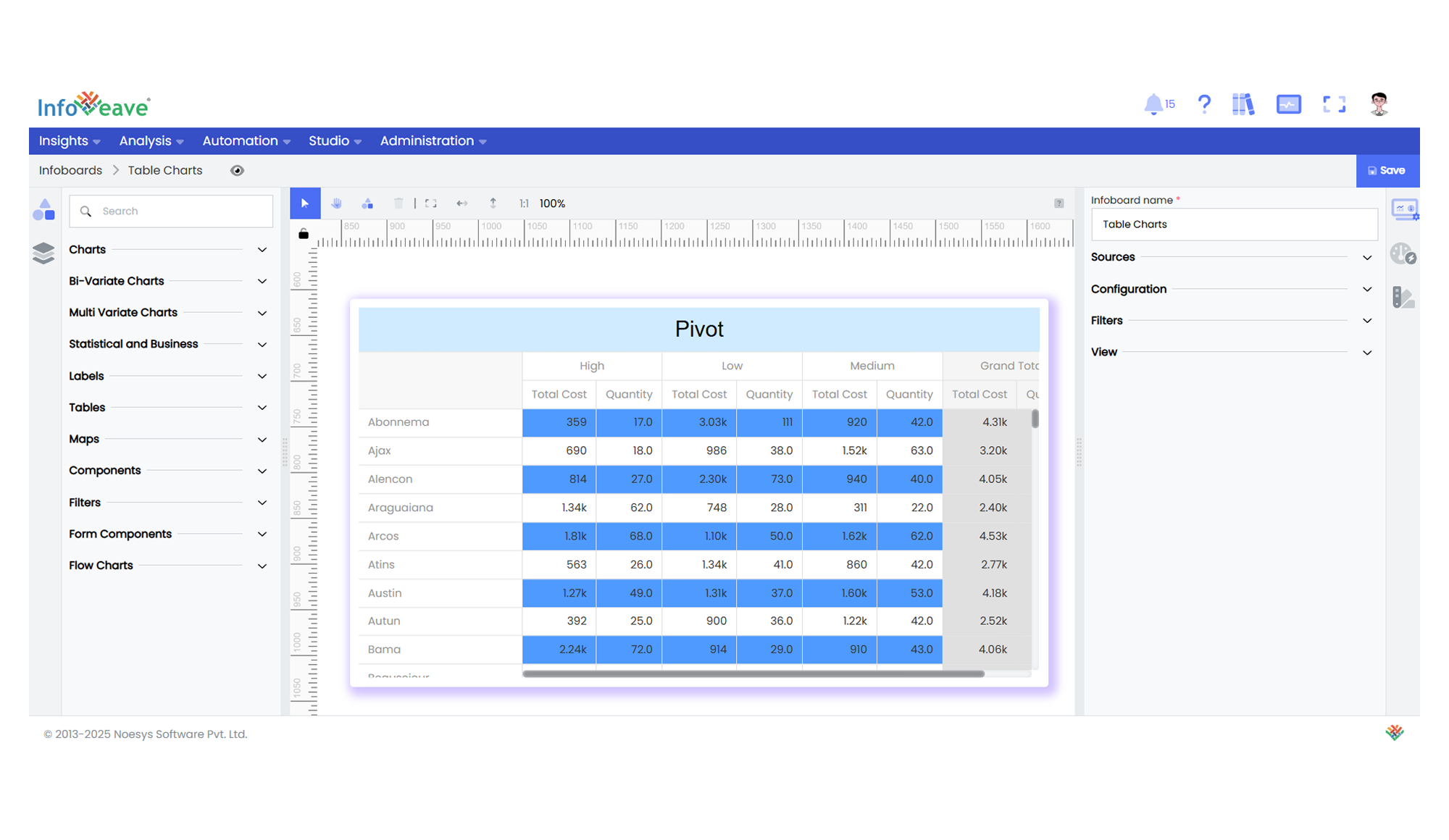
title: "Pivot"
description: "A dynamic table component for displaying grouped and aggregated data across configurable row and column dimensions."
group: Charts
tags: [Visualization, Pivot, Table, Data Grid, Aggregation, Cross Tab]
---
import { Aside, Steps } from '@astrojs/starlight/components';
# Pivot
The **Pivot Table** is a highly flexible, interactive table visualization that summarizes and organizes large datasets. It allows you to arrange data dynamically into rows and columns, with configurable aggregation functions like Sum, Average, Min, Max, and more. Both traditional and virtualized rendering modes are available for handling large data volumes efficiently.
**Key Features:**
- Group and aggregate data dynamically by **rows** and **columns**.
- Customizable **aggregation types**: Sum, Avg, Min, Max, None.
- Apply **cell background coloring rules** and per-row color customization.
- Optional **virtualized rendering** for large data performance.
- Control over **row/column totals, sorting, layout**, and header display.
- Supports **multiple measure fields**.
- Allows configuration of **cell borders, fonts, text wrapping**, and other styling.
**Use Cases:**
- Dynamic cross-tab reports.
- Financial data summaries.
- Sales performance by region/product/customer.
- Data matrix visualizations with totals and subtotals.
---
## ⚙️ Setup
1. Add a **Pivot Table** widget from the chart library onto your designer workspace.
2. Select the chart.
3. Go to the [Widget Configuration](/insights-v8/guide-to-infoboard-designer/customize-panel/configure/) tab in the Customize panel.
4. Under the Configuration tab, select the [Basic Configuration](/insights-v8/guide-to-infoboard-designer/customize-panel/configure/#basic) option to access the essential settings for the pivot table chart.
5. Select the [Source](/insights-v8/guide-to-infoboard-designer/customize-panel/setup/#sources) which the chart will pull the data from the option.
4. Map:
- **[Measures](/studio-v8/datasources/measures-dimensions-and-hierarchies/)** — numeric fields you want to summarize (required, min 1).
- **[Rows](/studio-v8/datasources/measures-dimensions-and-hierarchies/)** — category fields to group as table rows.
- **[Columns](/studio-v8/datasources/measures-dimensions-and-hierarchies/)** — category fields to group as table columns.
7. Optionally add a **Date** field for time-based filtering.
8. Enable **Hide Zero Values** to omit symbols with zero values if needed.
---
## 📊 Basic Configuration
| Configuration Item | Description |
|:------------------|:------------------------------------------------|
| **[Source](/insights-v8/guide-to-infoboard-designer/customize-panel/setup/#sources)** | Source providing the data for measures and dimensions. |
| **[Measures](/studio-v8/datasources/measures-dimensions-and-hierarchies/)** | Numeric values to aggregate (Sum, Avg, etc.). |
| **[Rows](/studio-v8/datasources/measures-dimensions-and-hierarchies/)** | Grouping fields for table rows. |
| **[Columns](/studio-v8/datasources/measures-dimensions-and-hierarchies/)** | Grouping fields for table columns. |
---
## 🎨 Table Customizations
| Category | Options & Description |
|:------------|:------------------------------------------------|
| **[General](/insights-v8/guide-to-infoboard-designer/customize-panel/customization-tab/#general)** | Modify the chart’s general appearance, including the background color, borders, shadows, and drill-out choices.
| **[Title](/insights-v8/guide-to-infoboard-designer/customize-panel/customization-tab/#title)** | Enable and customize chart title text, alignment, font, and color. |
| **[Grid](/insights-v8/guide-to-infoboard-designer/customize-panel/customization-tab/#grid)** | Adjust chart margins, grid spacing, and padding around the matrix area. |
| **[Pivot Options](/insights-v8/guide-to-infoboard-designer/customize-panel/customization-tab/#series-customization)** | Virtualization, totals, sorting, header layout, text wrapping, border colors, and row/column visibility. |
| **[Series (Columns)](/insights-v8/guide-to-infoboard-designer/customize-panel/customization-tab/#series-customization)** | Cell background color rules, totals/grand total colors, row coloring, and aggregation type per column. |
---
## 📊 Example Visualization