---
title: "Chord"
description: "A circular relationship diagram that visualizes interconnections between categories through arcs and ribbons, ideal for illustrating relationships and flows within data."
group: Charts
tags: [Visualization, Chart, Dashboard, Chord, Relationship, Network, Flow]
---
import { Aside, Steps } from '@astrojs/starlight/components';
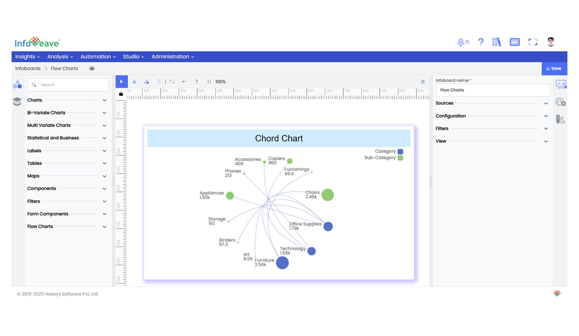
# Chord
The **Chord Chart** is a specialized diagram used to display the inter-relationships between data categories.
Categories are arranged around a circle, with curved lines or ribbons connecting them to visualize the strength and flow of relationships between paired dimensions.
**Use cases:**
- Visualizing **relationships or flows between categories**.
- Showing **network structures** or **cross-dimensional connections**.
- Comparing **interdependent quantities** across multiple categories.
---
## ⚙️ Setup
1. Drag the **Chord Chart** widget from the chart library onto your designer workspace.
2. Select the chart.
3. Go to the [Widget Configuration](/insights-v8/guide-to-infoboard-designer/customize-panel/configure/) tab in the Configuration panel.
4. Under the Configuration panel tab, select the [Basic Configuration](/insights-v8/guide-to-infoboard-designer/customize-panel/configure/#basic) option to access essential settings for the Chord Chart.
5. Select the [Source](/insights-v8/guide-to-infoboard-designer/customize-panel/setup/#sources) from which the chart will fetch its data.
6. Map:
- **[Measure](/studio-v8/datasources/measures-dimensions-and-hierarchies/)** — Numeric value representing the relationship magnitude.
- **[Dimension](/studio-v8/datasources/measures-dimensions-and-hierarchies/)** — Multiple categorical values (minimum 2) representing the categories around the circle.
7. Optionally add a **Date** field for time-based filtering.
---
## 📊 Basic Configuration
| Configuration Item | Description |
|:---------------------|:-------------|
| **[Source](/insights-v8/guide-to-infoboard-designer/customize-panel/setup/#sources)** | The data source to query for chart values. |
| **[Measure](/studio-v8/datasources/measures-dimensions-and-hierarchies/)** | Numeric value representing the size of connections between categories. |
| **[Dimension](/studio-v8/datasources/measures-dimensions-and-hierarchies/)** | At least two categorical dimensions used to create the relationships and groupings around the circle. |
| **Date Field** (optional) | Enables date-based filtering and drilldown capability. |
---
## 🎨 Chart Customizations
| Category | Options & Description |
|:----------------------------|:-----------------------------------------------------------|
| **[General](/insights-v8/guide-to-infoboard-designer/customize-panel/customization-tab/#general)** | Theme, background, border, and interactivity options. |
| **[Title](/insights-v8/guide-to-infoboard-designer/customize-panel/customization-tab/#title)** | Chart title, font, alignment, and visibility settings. |
| **[Sorting](/insights-v8/guide-to-infoboard-designer/customize-panel/customization-tab/#sorting)** | Define custom sorting for dimensions and connection order. |
| **[Position](/insights-v8/guide-to-infoboard-designer/customize-panel/customization-tab/#position)** | Adjust horizontal and vertical positioning of the chord within the chart. |
| **[Legend](/insights-v8/guide-to-infoboard-designer/customize-panel/customization-tab/#legends)** | Show/hide, position, and format for category legends. |
| **[Series](/insights-v8/guide-to-infoboard-designer/customize-panel/customization-tab/#series-customization)** | Customize node sizes, connection curviness, colors, labels, and positioning of the connections. |
| **[Tooltip](/insights-v8/guide-to-infoboard-designer/customize-panel/customization-tab/#tooltip)** | Tooltip content, format, and triggers for node and connection hover details. |
| **Others** | Configure symbol sizes, line curviness, connection colors (by Source or Target), and layout orientation. |
---
## 📊 Example Visualization