---
title: "Funnel Flow"
description: "Visualizes conversion and drop-off between sequential stages using proportional rectangles and connecting links."
group: Charts
tags: \[Visualization, Chart, Dashboard, Insights, Funnel, Flow, Conversion]
----------------------------------------------------------------------------
import { Aside, Steps } from '@astrojs/starlight/components';
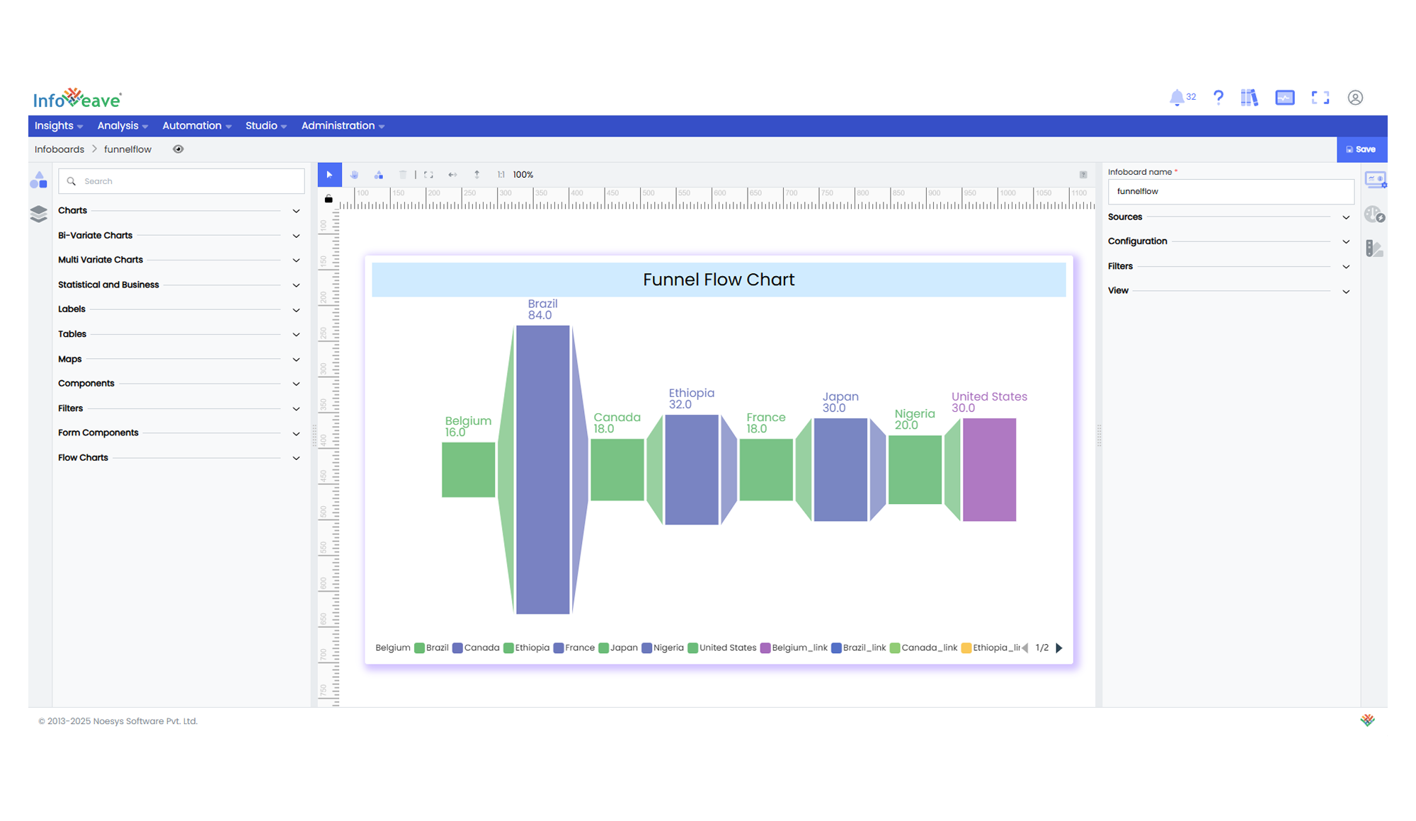
# Funnel Flow
The **Funnel Flow Chart** is a sequential‑stage visualization that compares values across steps in a process. Each **stage** is drawn as a rectangle scaled to its **value**, while tapered links connect consecutive stages to reveal how values increase or decrease along the funnel.
Unlike single‑column funnel charts, Funnel Flow Charts emphasise the flow between stages by visually bridging them with connectors, making drop‑offs or growth immediately apparent.
**Use cases:**
- **Sales funnel** conversion analysis
- **Customer journey** drop‑off tracking
- **Pipeline** performance monitoring
---
## ⚙️ Setup
1. Drag the **Funnel Flow Chart** widget from the chart library onto your designer workspace.
2. Select the chart.
3. Go to the [Widget Configuration](/insights-v8/guide-to-infoboard-designer/customize-panel/configure/) tab in the Customize panel.
4. Under the Configuration tab, select the [Basic Configuration](/insights-v8/guide-to-infoboard-designer/customize-panel/configure/#basic) option to access the essential settings for the funnel flow chart.
5. Select the [Source](/insights-v8/guide-to-infoboard-designer/customize-panel/setup/#sources) that the chart will pull data from.
6. Map:
- **[Measure (Value)](/studio-v8/datasources/measures-dimensions-and-hierarchies/)** — Numerical metric used to size each stage.
- **[Dimension (Stage)](/studio-v8/datasources/measures-dimensions-and-hierarchies/)** — Categorical field defining the sequential stages.
7. Define **Sorting** to control the order in which stages appear.
---
## 📊 Basic Configuration
| Configuration Item | Description |
| :------------------------------------------------------------------------------------ | :-------------------------------------------------------------- |
| **[Source](/insights-v8/guide-to-infoboard-designer/customize-panel/setup/#sources)** | Data source from which the chart fetches values. |
| **[Measure (Value)](/studio-v8/datasources/measures-dimensions-and-hierarchies/)** | Numerical metric that determines rectangle size for each stage. |
| **[Dimension (Stage)](/studio-v8/datasources/measures-dimensions-and-hierarchies/)** | **Required** - Categorical stages to visualise. | |
| **Hide Zero Values** | Option to suppress symbols with zero value from display. |
---
## 🎨 Chart Customizations
| Category | Options & Description |
| :------------------------------------------------------------------------------------------------------------- | :---------------------------------------------------------------------------------------------------------------------- |
| **[General](/insights-v8/guide-to-infoboard-designer/customize-panel/customization-tab/#general)** | Configure theme, background colour, borders, and drill‑down behaviour. |
| **[Title](/insights-v8/guide-to-infoboard-designer/customize-panel/customization-tab/#title)** | Enable, edit, and style the chart title text, font, colour, and alignment. |
| **[Sorting](/insights-v8/guide-to-infoboard-designer/customize-panel/customization-tab/#sorting)** | Define ascending/descending or custom order of stages. |
| **[Grid](/insights-v8/guide-to-infoboard-designer/customize-panel/customization-tab/#grid)** | Adjust chart margins, spacing, and overall layout. |
| **[Legend](/insights-v8/guide-to-infoboard-designer/customize-panel/customization-tab/#legends)** | Toggle visibility, position, orientation, and customise legend labels and icons. |
| **[Series](/insights-v8/guide-to-infoboard-designer/customize-panel/customization-tab/#series-customization)** | Customise stage colours/gradients, enable custom colour, control label display, orientation, position, and label lines. |
| **[Tooltip](/insights-v8/guide-to-infoboard-designer/customize-panel/customization-tab/#tooltip)** | Control tooltip content, formatting, and visibility on hover. |
---
## 📊 Example Visualization