---
title: "Bi-Variate Column"
description: "Compare multiple grouped or split categorical values across multiple panels using column charts."
group: Charts
tags: [Visualization, Chart, Dashboard, Categorical Comparison, Split Charts, Small Multiples]
---
import { Aside, Steps } from '@astrojs/starlight/components';
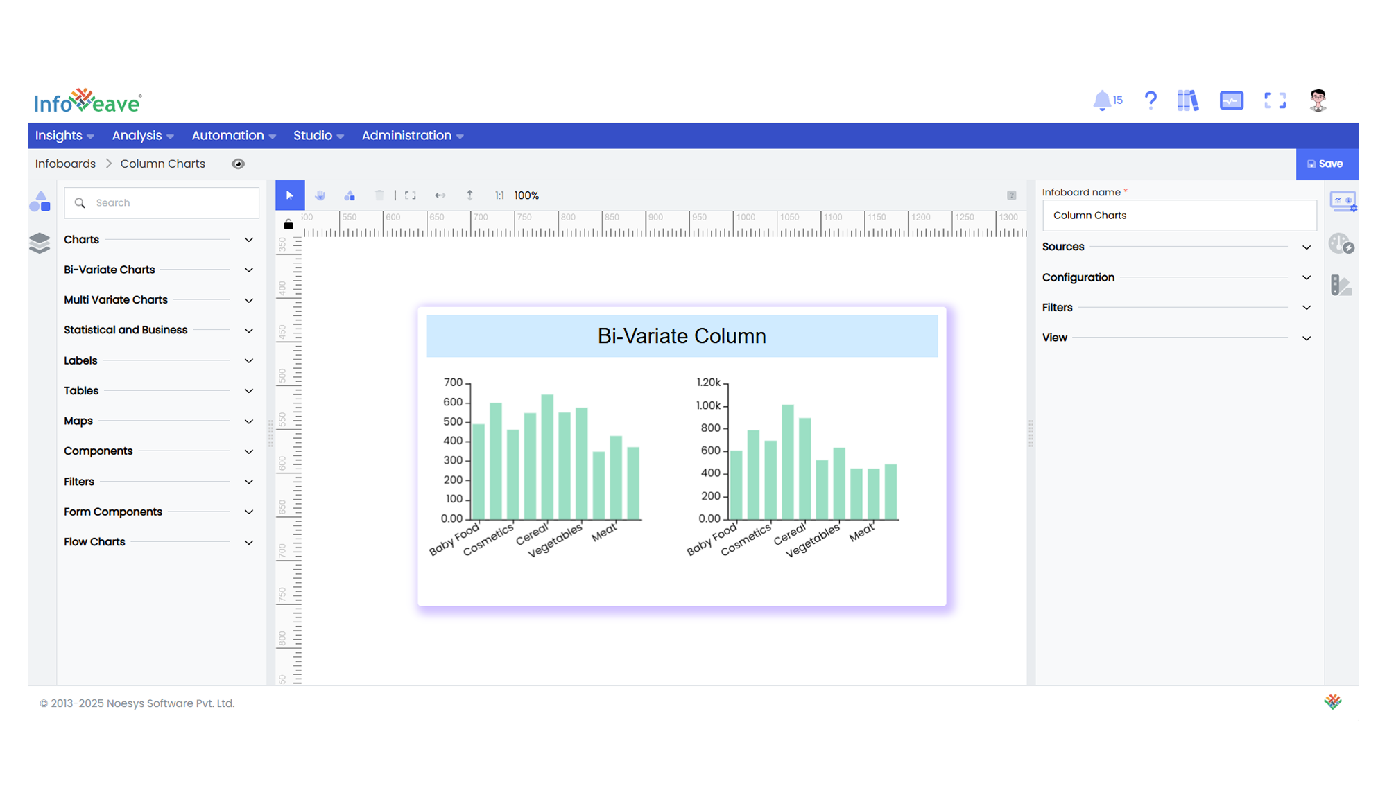
# Bi-Variate Column
A **BiVariate Column Chart** is a powerful extension of a standard column (bar) chart designed for comparing multiple split groups across categories. It can render one or more grids side by side (or in a grid layout), each showing a subset of data segmented by a **Split dimension**. Optionally, a **Group dimension** can be added to stack or cluster bars within each category.
**Key Features:**
- Supports **multi-panel (small multiples)** column charts split by a chosen dimension.
- Optional **stacking** or **side-by-side grouping** for comparisons within each panel.
- Customize bar **border radius**, **shadow effects**, and **heatmap coloring**.
- Interactive tooltips and zoom options for both axes.
- Flexible sorting, axis, legend, and series options.
- Supports pivoting data by Group and Axis dimensions dynamically.
**Use Cases:**
- Comparing multiple product categories over time across different regions.
- Visualizing department-wise metrics split by location or demographic.
- Market share breakdown by brand within multiple countries.
- Year-on-year metric comparisons split by divisions.
---
## ⚙️ Setup
1. Drag the **BiVariate Column Chart** widget from the chart library onto your designer workspace.
2. Select the chart.
3. Go to the [Widget Configuration](/insights-v8/guide-to-infoboard-designer/customize-panel/configure/) tab in the Customize panel.
4. Under the Configuration tab, select the [Basic Configuration](/insights-v8/guide-to-infoboard-designer/customize-panel/configure/#basic) option to access the essential settings for the bi variate column chart.
5. Select the [Source](/insights-v8/guide-to-infoboard-designer/customize-panel/setup/#sources) which the chart will pull the data from the option.
6. Map:
- **[Value (Measure)](/studio-v8/datasources/measures-dimensions-and-hierarchies/)** — The numeric metric to be displayed as bar height.
- **[Axis (Dimension)](/studio-v8/datasources/measures-dimensions-and-hierarchies/)** — The categorical value for the X-axis.
- **[Split (Dimension)](/studio-v8/datasources/measures-dimensions-and-hierarchies/)** — The dimension to split charts into multiple grids (e.g. region, year).
- (Optional) **[Group (Dimension)](/studio-v8/datasources/measures-dimensions-and-hierarchies/)** — A second category to stack or group bars inside each panel.
7. Optionally add a **Date** field for time-based filtering.
8. Enable **Hide Zero Values** to omit symbols with zero values if needed.
---
## 📊 Basic Configuration
| Configuration Item | Description |
|:------------------|:----------------------------|
| **[Source](/insights-v8/guide-to-infoboard-designer/customize-panel/setup/#sources)** | Source providing the data for measures and dimensions. |
| **[Value](/studio-v8/datasources/measures-dimensions-and-hierarchies/)** | Numeric measure displayed as bar height. |
| **[Axis](/studio-v8/datasources/measures-dimensions-and-hierarchies/)** | Categorical label for each bar. |
| **[Split](/studio-v8/datasources/measures-dimensions-and-hierarchies/)** | Splits data into multiple grids/panels. |
| **[Group](/studio-v8/datasources/measures-dimensions-and-hierarchies/)** (optional) | Second categorical dimension to group/stack bars within a panel. |
---
## 🎨 Chart Customizations
| Category | Options & Description |
|:---------|:-------------------------------------------------|
| **[General](/insights-v8/guide-to-infoboard-designer/customize-panel/customization-tab/#general)** | Modify the chart’s general appearance, including the background color, borders, shadows, and drill-out choices.
| **[Title](/insights-v8/guide-to-infoboard-designer/customize-panel/customization-tab/#title)** | Enable and customize chart title text, alignment, font, and color. |
| **[Sorting](/insights-v8/guide-to-infoboard-designer/customize-panel/customization-tab/#sorting)** | Set sort order for Axis values. |
| **[Grid](/insights-v8/guide-to-infoboard-designer/customize-panel/customization-tab/#grid)** | Adjust chart margins, grid spacing, and padding around the matrix area. |
| **[Legend](/insights-v8/guide-to-infoboard-designer/customize-panel/customization-tab/#legends)** | Toggle visibility, position, orientation, and customize legend labels and icons. |
| **[HeatMap](/insights-v8/guide-to-infoboard-designer/customize-panel/customization-tab/#heatmap)** | Configure a visual color map to represent value intensity with a gradient. |
| **[Categorical Axis (X, Y)](/insights-v8/guide-to-infoboard-designer/customize-panel/customization-tab/#categorical-axis)** | Customize axis labels, intervals, rotation, visibility, and range sliders for both axes. |
| **[Numerical Axis](/insights-v8/guide-to-infoboard-designer/customize-panel/customization-tab/#numerical-axis)** | Set axis type, scale (linear/log), and formatting. |
| **[Series](/insights-v8/guide-to-infoboard-designer/customize-panel/customization-tab/#series-customization)** | Customize bar width, color schemes, shadows, and stacking behavior. |
| **[Tooltip](/insights-v8/guide-to-infoboard-designer/customize-panel/customization-tab/#tooltip)** | Control tooltip content, formatting, and visibility on hover. |
| **[Others]** | Stack bars, apply custom colors to single-series mode, control border radius, and box shadows. |
---
## 📊 Example Visualization