---
title: "Segment Widget"
description: "A compact visualization widget displaying a primary metric with segmented breakdowns, progress bars, and optional icons. Ideal for KPIs with compositional context."
group: Widgets
tags: [Visualization, Metric, Progress, Dashboard, Breakdown]
---
import { Aside, Steps } from '@astrojs/starlight/components';
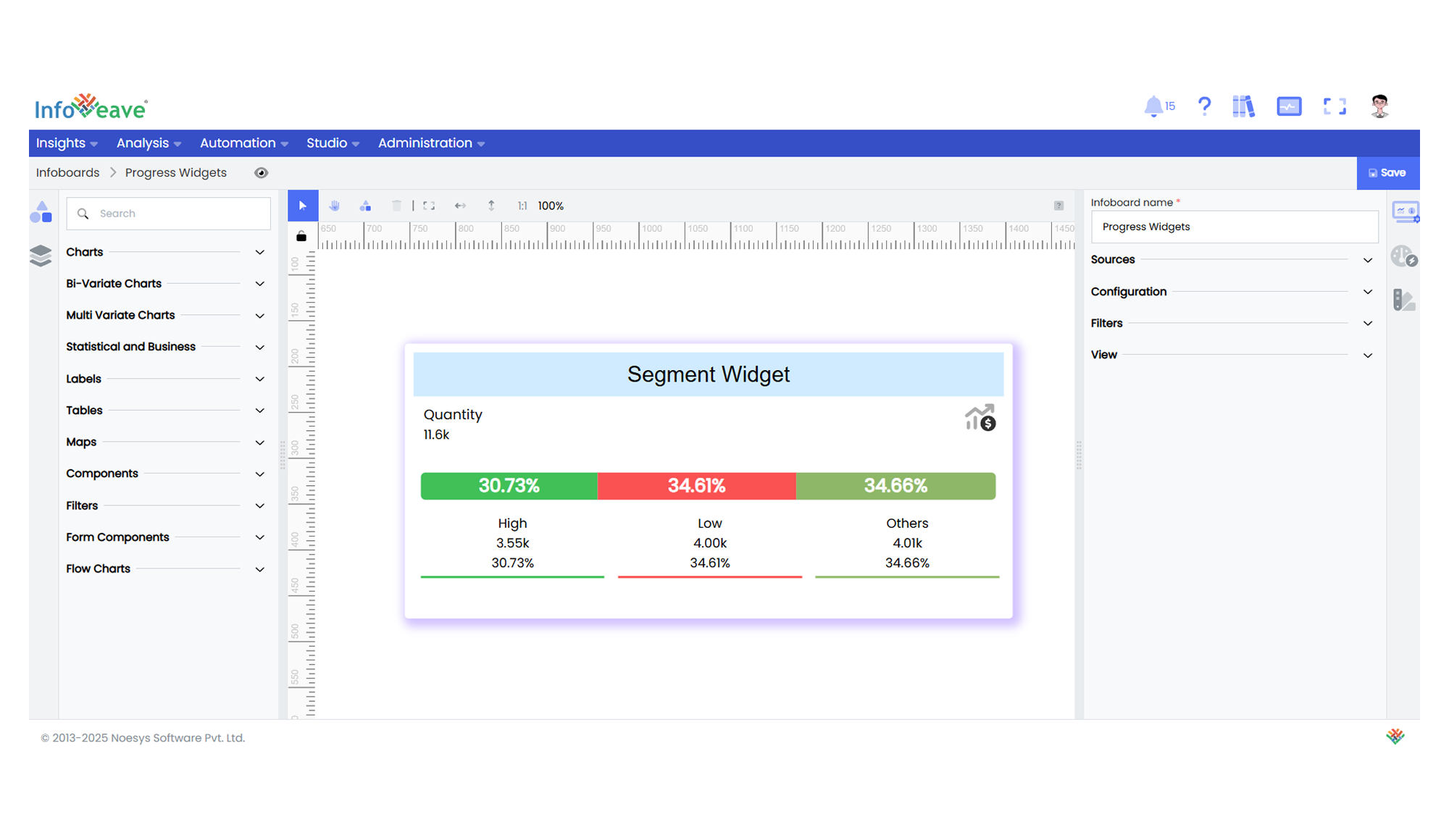
# Segment Widget
The **Segment Widget** combines a primary metric value with a segmented progress bar and optional dimension breakdowns. It emphasizes both the **total value** and its **composition** in a space-efficient layout.
**Key features:**
- Displays a **primary measure** (e.g., total revenue) with customizable labels/icons
- Visualizes segments via **progress bars** with color-coded subdivisions
- Supports **top-N breakdown** with optional "Others" aggregation
- Interactive **tooltips** for detailed segment exploration
---
## ⚙️ Setup
1. Drag the **Segment Widget** widget from the chart library onto your designer workspace.
2. Select the chart.
3. Go to the [Widget Configuration](/insights-v8/guide-to-infoboard-designer/customize-panel/configure/) tab in the Configuration panel.
4. Under the Configuration panel tab, select the [Basic Configuration](/insights-v8/guide-to-infoboard-designer/customize-panel/configure/#basic) option to access the essential settings for the widget.
5. Select the [Source](/insights-v8/guide-to-infoboard-designer/customize-panel/setup/#sources) which the chart will pull the data from.
6. Map:
- **[Measure](/studio-v8/datasources/measures-dimensions-and-hierarchies/)** —Your primary numeric metric.
- **[Dimension](/studio-v8/datasources/measures-dimensions-and-hierarchies/)** — Categorical field for segmentation.
7. Optionally add a **Date** field for time-based filtering.
---
## 📊 Basic Configuration
| Configuration Item | Description |
|:---------------------|:-------------|
| **[Source](/insights-v8/guide-to-infoboard-designer/customize-panel/setup/#sources)** | Source providing the data for measures and dimensions. |
| **[Measure](/studio-v8/datasources/measures-dimensions-and-hierarchies/)** | Primary numeric value. |
| **[Dimension](/studio-v8/datasources/measures-dimensions-and-hierarchies/)** | Categorical field for segmentation. |
| **Date Field** (optional) | Date dimension for time-based data filtering. |
---
## 🎨 Chart Customizations
| Category | Options & Description |
|:----------------------------|:-----------------------------------------------------------|
| **[General](/insights-v8/guide-to-infoboard-designer/customize-panel/customization-tab/#general)** | Modify the chart’s background color, borders, shadows, and drill-out options. |
| **[Title](/insights-v8/guide-to-infoboard-designer/customize-panel/customization-tab/#title)** | Enable and customize chart title text, alignment, font, and color. |
| **[Series](/insights-v8/guide-to-infoboard-designer/customize-panel/customization-tab/#series-customization)** | Configures segment-specific styling |
| **Options** | Handles core widget behaviors: Measure value/label display , Progress bar visibility/animation, Segment limiting (top-N items), Icon positioning and styling |
| **[Tooltip](/insights-v8/guide-to-infoboard-designer/customize-panel/customization-tab/#tooltip)** | Configure tooltip content, formatting, and hover behavior. |
| **Others** | Control **Stack**, **Stack as Percentage**, and **Colorize Single Series** options. |
---
## 📊 Example Visualization