
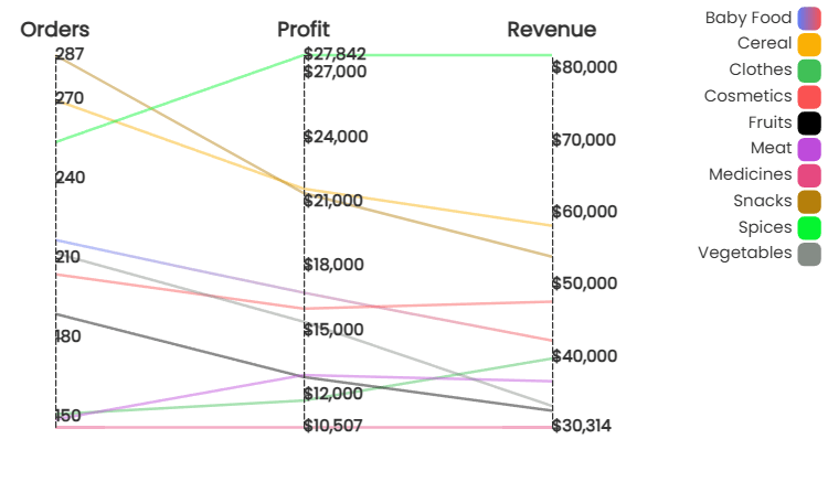
Parallel Chart
A parallel axis chart helps you analyze and visualize relationships between multiple measure values across a single dimension value (such as category, sales channel, product type) simultaneously. As the name suggests, the parallel chart showcases multiple axes, each representing an independent measure value. The datapoints across each measure value axis are connected through a line indicating the relationship between each value axis for the selected dimension value. The parallel axis chart supports direct comparisons between data points across the measure value axes.
Parallel Chart
Basic Configuration
Add and configure the parallel axis chart in Infoveave with the simple drag-and-drop option. Select the Datasource, the associated measure and the dimensions required. Below are the simple steps on how to configure a parallel chart in Infoveave.
- Drag the parallel chart and drop it onto the designer workspace, from the chart library.
- Click on the parallel chart in the designer to select it.
- With the parallel chart selected, go to the Widget Configuration tab located in the Customize panel.
- Under the Configuration tab, select the Basic Configuration option to access the essential settings for the parallel chart.
- Select the Datasource from Source which the chart will pull the data from the option.
- Choose the Measure(s) that represents the numerical values you want to display on the parallel chart.
- Choose the Dimension(s) that represents the categorical values you want to display on the parallel chart.
- Use the Date (optional) to include a date dimension in your chart, useful for showing trends over time.
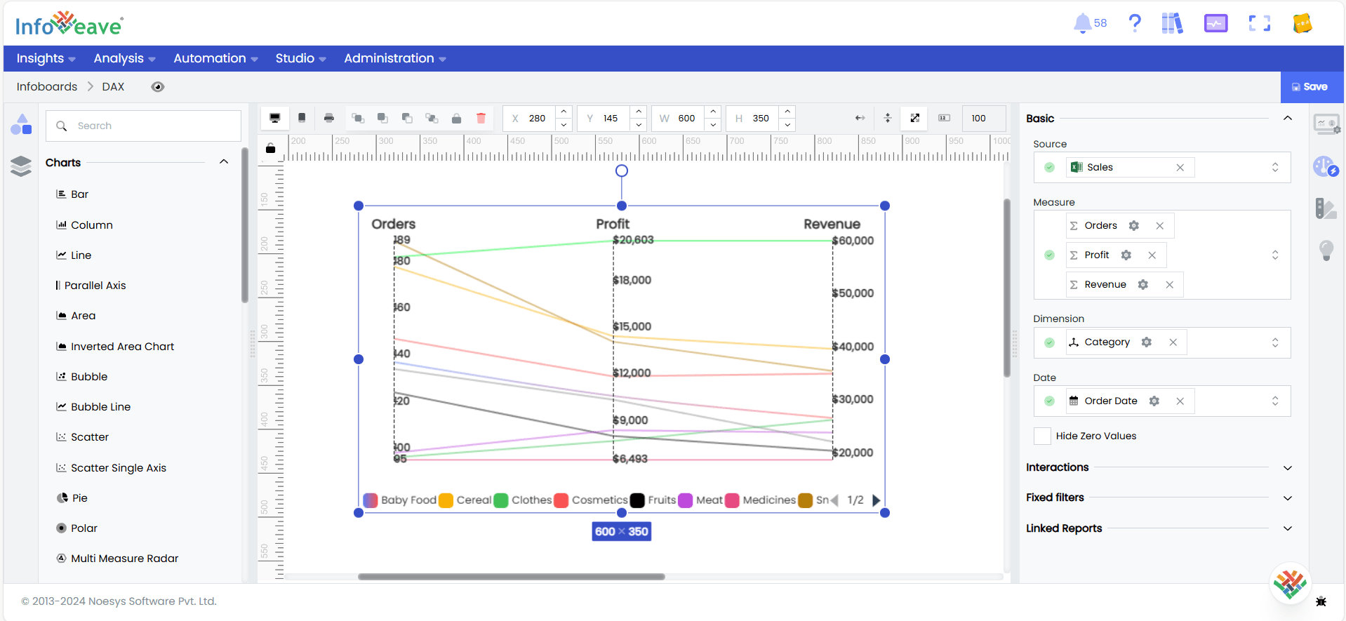
- Enable Hide Zero Values option (optional) to hide bars that have a value of zero.
Chart Customization
Customizing the parallel axis chart allows you to tailor the widget appearance to meet your theme. With improved customization you can enhance the clarity on the data points, the chart aesthetics and set interactivity filters making your dashboard visually appealing also effectively communicating your data insights.
With the parallel chart selected, go to the Widget Customization tab located in the Customize panel.
The basic customizations available for the bar/column chart are as below
- General Modify the chart’s general appearance, including the background color, borders, shadows, and drill-out choices.
- Title Enable and customize the chart title’s text, font, color, and alignment.
- Sorting Choose the order in which data points are shown in the chart.
- Grid Customize the visibility and style of grid lines and margins in the chart.
- Parallel Axis Customize the parallel axis, including labels, intervals, and range sliders.
- Legend Adjust the legend’s visibility, position, text, and orientation, as well as heatmap settings.
- Series Customize the look and behavior of the data series, such as labels, colors, and backdrop.
- Tooltip Customize the tooltip settings to improve the information shown when you hover over data points.
- Others Additional options for changing the chart orientation from horizontal to vertical.