
Pie/Donut/Rose Chart
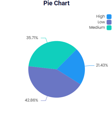
A pie chart is a type of visualization chart where the data is represented in circular format based on the categorical values, showcasing the part-to-whole contribution. Each slice of the chart represents individual categorical values. The arc length and the sector angle or area of each slice are directly proportional to the data. The slices in a pie chart add up to a total of 100% when viewed in percentage contribution. You can also showcase the data values on the pie chart without converting them to the percentage contribution.
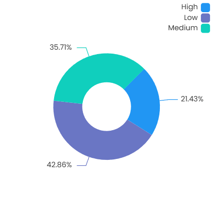
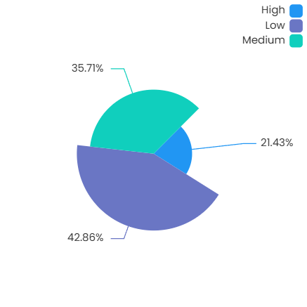
A donut chart is a type of pie chart with an inner radius. Compared to the pie chart, the donut chart showcases the data as arcs rather than slices. A rose chart, on the other hand, is another type of pie chart where all the area or radius of each slice is directly proportional to the data.
Pie Chart
Donut Chart
Rose Chart
Basic Configuration
Add and configure the pie chart in Infoveave with the simple drag-and-drop option. Select the Datasource, the associated measure and the dimensions required. Below are the simple steps on how to configure a pie chart in Infoveave.
- Drag the pie chart and drop it onto the designer workspace, from the chart library.
- Click on the pie chart in the designer to select it.
- With the pie chart selected, go to the Widget Configuration tab located in the Customize panel.
- Under the Configuration tab, select the Basic Configuration option to access the essential settings for the pie chart.
- Select the Datasource from Source which the chart will pull the data from the option.
- Choose the Measure(s) that represents the numerical values you want to display on the pie chart.
- Choose the Dimension(s) that represents the categorical values you want to display on the pie chart.
- Use the Date (optional) to include a date dimension in your chart, useful for showing trends over time.
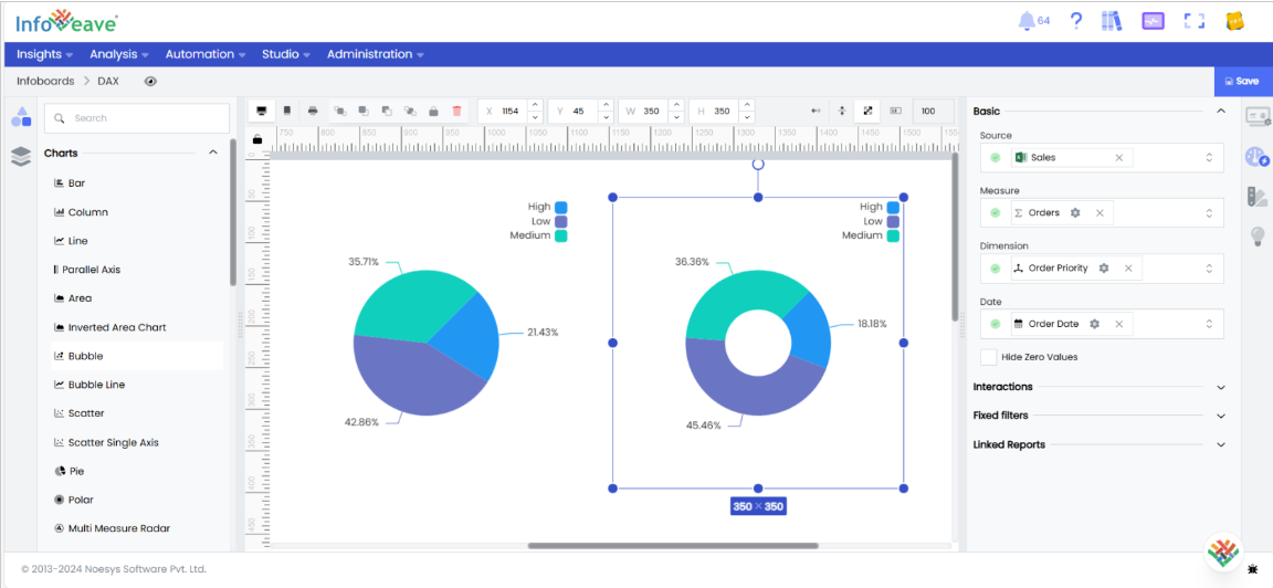
- Enable Hide Zero Values option (optional) to hide bars that have a value of zero.
Chart Customization
Customizing the pie chart allows you to tailor the widget appearance to meet your theme. With improved customization you can enhance the clarity on the data points, the chart aesthetics and set interactivity filters making your dashboard visually appealing also effectively communicating your data insights.
With the pie chart selected, go to the Widget Customization tab located in the Customize panel.
The basic customizations available for the pie chart are as below
- General Modify the chart’s general appearance, including the background color, borders, shadows, and drill-out choices.
- Title Enable and customize the chart title’s text, font, color, and alignment.
- Sorting Choose the order in which data points are shown in the chart.
- Position Set the vertical and horizontal position of the chart within the available chart area to present the chart in the best way.
- Legend Adjust the legend’s visibility, position, text, and orientation, as well as heatmap settings.
- Series Customize the look and behavior of the data series, such as labels, colors, and backdrop.
- Tooltip Customize the tooltip settings to improve the information shown when you hover over data points.
- Others Additional options for stacking data series and displaying them as percentages.