
Maps
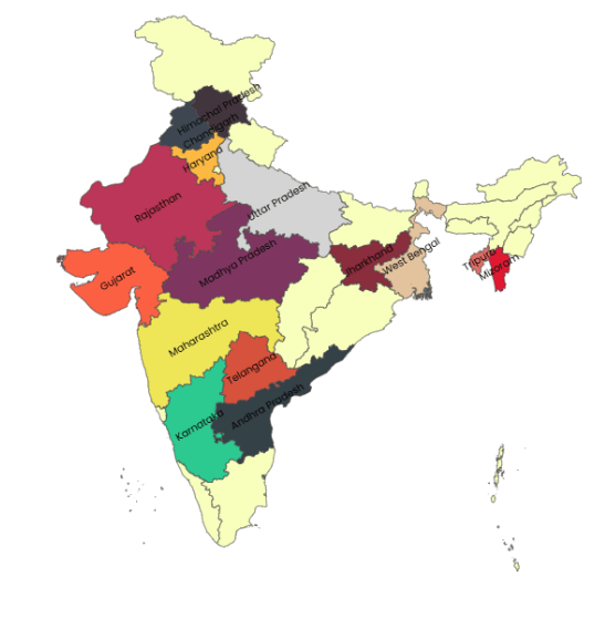
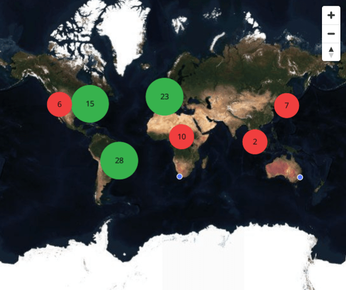
Map widgets, as the name suggests, allow you to visualize and analyze geographical data based on region and location. It helps you visually see the distribution or proportion of spatial data in each region. Infoveave offers both region-based and location-based maps, along with map visualizations such as basic, dataviz, and satellite view. The customization options for location maps include marker shapes, sizes, and colors; heatmaps for data density visualization; and clustering for grouping nearby data points.
Map Widget
Clustered Marker Map Widget
Basic Configuration
Add and configure the required map widget in Infoveave with the simple drag-and-drop option. Select the Datasource, the measure(s) and dimension(s) required. Below are the simple steps on how to configure a map widget in Infoveave.
- Drag the map widget and drop it onto the designer workspace, from the chart library.
- Click on the map widget in the designer to select it.
- With the map widget selected, go to the Widget Configuration tab located in the Customize panel.
- Under the Configuration tab, select the Basic Configuration option to access the essential settings for the map widget.
- Select the Datasource from Source which the chart will pull the data from the option.
- Choose the Measure(s) that represents the actual values you want to display on the map widget.
- Choose the Dimension(s) that represents the dimension values you want to display on the map widget.
- Use the Date (optional) to include a date dimension in your chart, useful for showing trends over time.
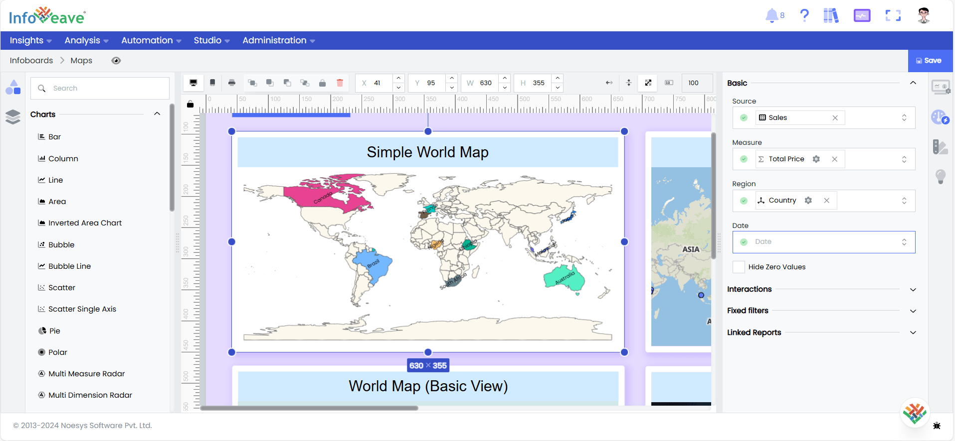
- Enable Hide Zero Values option (optional) to hide zero values.
Chart Customization
Customizing the map chart allows you to tailor the widget appearance to meet your theme. With improved customization you can enhance the clarity on the data points, the chart aesthetics and set interactivity filters making your dashboard visually appealing also effectively communicating your data insights.
With the map widget selected, go to the Widget Customization tab located in the Customize panel.
The basic customizations available for the map chart are as below
- General Modify the chart’s general appearance, including the background color, borders, shadows, and drill-out choices.
- Title Enable and customize the chart title’s text, font, color, and alignment.
- Tooltip Customize the tooltip settings to improve the information shown when you hover over data points.
- Maps Set the map specific customizations for the widget, such as the marker shapes, sizes, colors, heatmaps, and clustering.
- Series Customize the look and behavior of the individual dimension labels in your map widget to enhance the data visibility and clarity.