---
title: "Calendar"
description: "A visual calendar representation where colors represent data values over a time dimension — ideal for spotting trends and patterns over dates."
group: Charts
tags: [Visualization, Chart, Dashboard, Calendar, Heatmap, Time Series, Dates]
---
import { Aside, Steps } from '@astrojs/starlight/components';
# Calendar
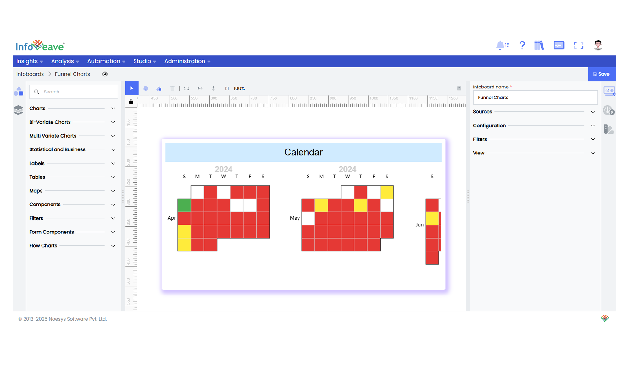
The **Calendar Chart** visualizes numerical data across a time-based calendar layout.
Each day is represented as a cell, color-coded based on its corresponding value.
This chart is perfect for detecting seasonality, activity patterns, and high/low occurrences within a timeline.
**Use cases:**
- Activity logs (logins, transactions, errors per day)
- Heat maps of sales or user activity by date
- Productivity patterns across months or years
- Visualizing server load or site visits daily over time
---
## ⚙️ Setup
1. Drag the **Calendar Chart** widget from the chart library onto your designer workspace.
2. Select the chart.
3. Go to the [Widget Configuration](/insights-v8/guide-to-infoboard-designer/customize-panel/configure/) tab in the Configuration panel.
4. Under the Configuration panel tab, select the [Basic Configuration](/insights-v8/guide-to-infoboard-designer/customize-panel/configure/#basic) option to access essential settings.
5. Choose the [Source](/insights-v8/guide-to-infoboard-designer/customize-panel/setup/#sources) to fetch data for the chart.
6. Map:
- **[Measure](/studio-v8/datasources/measures-dimensions-and-hierarchies/)** — The numeric value to be represented by color.
- **[Date](/studio-v8/datasources/measures-dimensions-and-hierarchies/)** — The date field associated with each value.
---
## 📊 Basic Configuration
| Configuration Item | Description |
|:---------------------|:-------------|
| **[Source](/insights-v8/guide-to-infoboard-designer/customize-panel/setup/#sources)** | The data source for your calendar values. |
| **[Measure](/studio-v8/datasources/measures-dimensions-and-hierarchies/)** | Numeric value to visualize by color intensity. |
| **[Date](/studio-v8/datasources/measures-dimensions-and-hierarchies/)** | Date field for placing values on the calendar layout. |
---
## 🎨 Chart Customizations
| Category | Options & Description |
|:----------------------------|:-----------------------------------------------------------|
| **[General](/insights-v8/guide-to-infoboard-designer/customize-panel/customization-tab/#general)** | Theme, background, accessibility settings. |
| **[Title](/insights-v8/guide-to-infoboard-designer/customize-panel/customization-tab/#title)** | Chart title, font, alignment. |
| **[Grid](/insights-v8/guide-to-infoboard-designer/customize-panel/customization-tab/#grid)** | Chart margins and layout spacing. |
| **[Tooltip](/insights-v8/guide-to-infoboard-designer/customize-panel/customization-tab/#tooltip)** | Display value info on hover. |
| **[HeatMap](/insights-v8/guide-to-infoboard-designer/customize-panel/customization-tab/#heatmap)** | Control color range, visual map, and intensity scales. |
| **Calendar** | Orientation (horizontal/vertical), splitting by Year/Month/None, cell sizing, and spacing between calendars. |
---
## 📊 Example Visualization